Posted on

How Businesses Can Prepare Artwork for Custom Printing

A good print order starts before production.

It starts with the artwork.

That does not mean every customer needs to be a professional designer. It does mean that files should be prepared with print in mind. A design that looks fine on a phone or laptop can run into problems once it becomes a sticker, label, card, invitation, or printed insert.

At Midea Print House, part of creating a clearer custom printing process is helping customers understand what makes artwork print-ready. Better files mean fewer delays, cleaner proofs, and a final product that is much closer to what the customer expected.

Use High-Resolution Files

Low-resolution artwork is one of the most common print problems.

A logo copied from a website may look fine on a screen, but it can print blurry or pixelated. Social media graphics are often too small for quality printing. Screens are forgiving. Printing is not.

For most print projects, artwork should be high resolution. If the design includes images, they should usually be prepared at 300 DPI at the final print size. Vector files are even better for logos, icons, and text-based artwork because they can scale without losing quality.

Good file types may include:

PDF

AI

EPS

SVG

High-resolution PNG

High-resolution TIFF

High-resolution JPEG, when saved properly

The best file depends on the product and design, but the goal is always the same: clean artwork at the correct size.

Understand Bleed and Safe Area

Bleed is extra artwork that extends beyond the final trim edge. It gives the printer room to cut without leaving unwanted white edges.

Safe area is the space inside the trim line where important text and design elements should stay.

Both matter.

If a design goes right to the edge but has no bleed, trimming can create thin white lines. If text sits too close to the edge, it may look cramped or risk being cut off. This is especially important for cards, invitations, labels, and full-color designs.

A simple rule: background colors and images can extend outward, but important text and logos should stay comfortably inside the safe area.

Borders can also be tricky. A thin border near the edge may look uneven after trimming, even if the cut is technically within normal tolerance. If your design depends on a perfect tiny border, print production may have other plans.

Convert Text Properly

Fonts can cause issues if they are not handled correctly.

If a printer does not have the font used in your file, the text may change when opened. That can alter spacing, line breaks, or the overall look of the design.

To avoid this, designers often outline text or embed fonts in the final file. This keeps the typography consistent when the printer opens the artwork.

Customers should also double-check spelling, names, addresses, and contact information before approving a proof. The printer can review technical setup, but the customer usually knows whether the phone number, event date, or product name is correct.

Think About Color

Color on a screen and color in print are not always identical.

Screens use light. Printing uses ink or toner on material. That difference can affect brightness, saturation, and tone. A color that glows on a phone may print more muted. Very dark colors may lose detail. Very light colors may be harder to see.

This does not mean printed color will look bad. It just means customers should understand that print is a physical process.

If color accuracy is critical, communicate that early. Brand colors, product packaging, and repeat orders may need extra attention to keep results consistent.

For general print education and production topics, Printiverse is a helpful resource for understanding how print materials, color, and production choices affect the final product.

Match the Design to the Product

Artwork should be designed for the actual item being printed.

A design that works on a large poster may not work on a two-inch sticker. A detailed illustration may lose impact on a small label. A QR code may fail if it is printed too small. A thin script font may look elegant on screen but become hard to read on textured paper.

Before sending artwork, ask:

What size will this print?

Will people read it up close or from a distance?

Is the text large enough?

Is the contrast strong enough?

Will the shape affect the design?

Does the design need a cut line?

Will this be applied to a curved surface?

Will it be handled often?

Design should follow the product’s real use.

Review the Proof Carefully

Once the proof arrives, slow down and review it.

Check the size. Check the layout. Check the cut line. Check spelling. Check alignment. Check the front and back if the product has both. Test QR codes. Confirm dates and contact details. Make sure nothing important is too close to the edge.

The proof is the best chance to catch problems before production.

Approving too quickly can lead to avoidable mistakes. Nobody enjoys reprinting a product because “Wednesday” was supposed to be “Thursday.” It happens. But it does not have to happen often.

Better Files Lead to Better Printing

Print-ready artwork makes the entire process smoother.

It helps the printer produce cleaner results. It reduces back-and-forth. It speeds up proofing. It makes reorders easier. And it gives customers more confidence that the finished product will match the original idea.

Custom printing does not need to be stressful. With good files, clear communication, and a careful proofing process, businesses can order stickers, labels, cards, invitations, and other printed materials with fewer surprises.

Posted on

Printed Invitations, Cards, and Paper Goods Still Matter

Digital communication is useful. It is fast, cheap, and convenient.

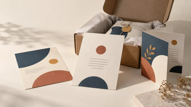
But printed invitations, cards, and paper goods still have a place because they feel more intentional. A printed piece asks for attention in a way an email rarely does. It can be held, saved, displayed, handed out, mailed, photographed, and remembered.

That is why businesses, organizations, and event planners still use printed materials for important moments.

At Midea Print House, custom paper goods are part of a broader print offering for branding, events, promotions, internal operations, and creative projects. The goal is not to print paper for the sake of paper. The goal is to make useful printed pieces that feel clear, consistent, and ready to use.

Printed Invitations Feel More Personal

An invitation does more than share information. It sets expectations.

A wedding invitation, corporate event invite, fundraiser card, graduation announcement, or product launch invitation all tell the recipient what kind of event they are being invited to. The design, paper, finish, and wording all contribute to that first impression.

A simple card can feel casual and friendly. A heavier stock can feel formal. A soft-touch finish can feel modern. Foil can feel celebratory. A minimalist layout can feel elegant. A bold color palette can feel energetic.

The point is not that every invitation needs to be expensive. It does not. The point is that the physical piece should match the event.

A backyard birthday party and a black-tie fundraiser should not look like they came from the same template unless something has gone badly wrong.

Cards Are Useful for More Than Events

Custom cards are one of the most flexible print products a business can order.

They can be used as:

Thank-you cards

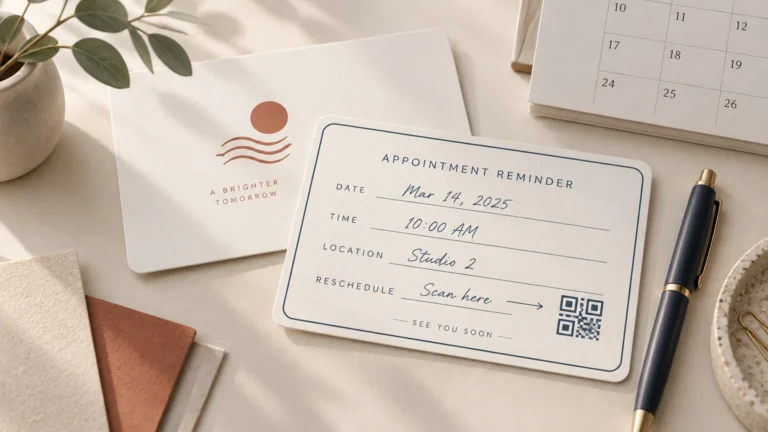
Appointment cards

Product insert cards

Care instruction cards

Loyalty cards

Referral cards

Gift notes

Packaging inserts

Discount cards

Event schedules

Menu cards

Business information cards

This makes them useful across many industries. A skincare brand can include product care cards. A restaurant can print menu inserts. A photographer can send thank-you cards. A local shop can use loyalty cards. A nonprofit can mail donor appreciation notes.

Cards are simple, but they carry information well.

Paper Quality Changes the Feeling

The same design can feel very different depending on the paper.

Thin paper may be fine for a short-term insert, but it may not feel right for a premium invitation. A thick card stock can make a business card or event card feel more substantial. Matte paper can feel clean and modern. Gloss can make color-heavy designs feel brighter. Textured paper can add a more traditional or handcrafted feel.

Choosing paper is not just about looks. It is about use.

Ask:

Will this be mailed?

Will it be handed out?

Does it need to be written on?

Does it need to feel formal?

Does it need to match packaging?

Will it be kept or discarded quickly?

Is it part of a larger printed set?

These questions help narrow the options before production begins.

For invitation-specific printing, PrintInvitations.com is a useful example of a print provider focused on event stationery and invitation products. For broader custom printing needs, Midea Print House can support paper goods as part of a wider brand or event print package.

Design Should Be Clear First

A beautiful printed card still needs to be readable.

For invitations, the date, time, location, RSVP details, and names need to be clear. For business cards, contact information needs to be easy to find. For insert cards, instructions should be simple. For promotional cards, the offer should not be buried under too much decoration.

Good card design usually has:

A clear hierarchy

Readable fonts

Enough spacing

Strong contrast

Correct margins

Simple wording

A clean front and back layout

If the reader cannot quickly understand the card, the design is not finished.

Proofing Is Especially Important

Printed cards often include information that cannot be wrong.

Dates, names, addresses, phone numbers, URLs, discount codes, QR codes, and event details need careful review. Even a small typo can create confusion or require a reprint.

A proofing step gives customers a chance to catch those issues before production.

For event pieces, it is smart to have more than one person review the proof. One person may check the design. Another may check names and spelling. Another may confirm times, addresses, and links.

It may feel tedious, but it is better than mailing 300 invitations with the wrong ceremony time. That is not a charming surprise.

Print Adds Weight to the Message

Printed invitations, cards, and paper goods still matter because they feel deliberate.

They are not right for every message. But when the moment matters, print gives the message weight. It shows care. It creates a stronger impression. It gives customers, guests, or recipients something physical to hold onto.

For businesses and organizations, that can make a real difference.

A printed card can say thank you. It can explain a product. It can invite someone to an event. It can make packaging feel complete. It can make a brand feel more trustworthy.

Digital is convenient. Print is memorable.

There is room for both.

Posted on

Why Custom Stickers and Labels Matter for Growing Brands

Custom stickers and labels are small, but they do a lot of work.

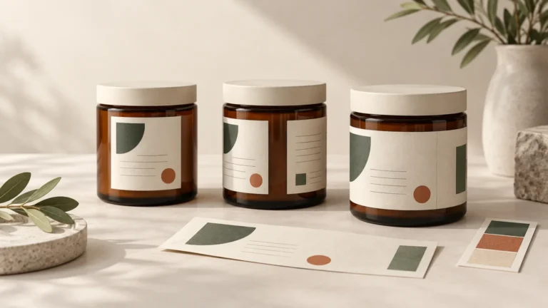
They show up on packages, bottles, jars, mailers, boxes, laptops, notebooks, event tables, product samples, shipping bags, and giveaway packs. They can make a plain container look branded. They can make a small business look more established. They can turn a simple package into something customers remember.

For growing brands, custom stickers and labels are often one of the most practical print products to order first.

At Midea Print House, stickers and labels fit into a larger custom printing process built around branding, packaging, promotions, and business communication. They are simple products on the surface, but when they are done well, they make a brand feel more complete.

Stickers Help Make Packaging Feel Finished

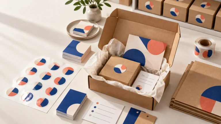
A blank box or pouch can work, but it rarely feels memorable. Add a clean logo sticker, product label, thank-you seal, or branded closure sticker, and the same package feels more intentional.

That matters because packaging is part of the customer experience.

A customer may not remember every detail of a purchase, but they often remember whether the package looked professional. Small touches can make a brand feel more trustworthy, especially for online shops, handmade goods, food businesses, beauty brands, subscription boxes, and local retailers.

A sticker can be used for:

Logo branding

Product names

Flavor or scent labels

Limited edition packaging

Seasonal promotions

Thank-you seals

Warning or care instructions

QR code links

Event giveaways

Retail display packaging

This flexibility makes stickers useful for both new brands and established companies.

Labels Need to Be Practical

A label is not only decoration. It often carries information customers need.

That might include ingredients, sizing, usage instructions, barcodes, batch numbers, contact details, website links, or product descriptions. If that information is hard to read, poorly placed, or printed on the wrong material, the product can feel less professional.

The right label should match the product’s environment.

A candle label has different needs than a drink bottle label. A shipping label has different needs than a retail jar label. A waterproof product needs different material than a short-term event giveaway.

Before ordering, brands should think about:

Where the label will be applied

Whether the surface is flat or curved

Whether the product gets wet or handled often

How long the label needs to last

Whether the label needs to be removable

Whether the design uses small text

Whether a roll label or individual sticker makes more sense

These details help prevent the common problem of ordering a label that looks good online but does not work well in real life.

Good Design Makes Stickers More Useful

A sticker does not need to be complicated to be effective. In fact, simpler is often better.

Strong sticker design usually includes:

Clear branding

Readable text

Enough contrast

A shape that fits the design

Proper spacing around important elements

A size that matches the use

A design that works from a few feet away

Tiny text can be a problem. Thin borders can be risky. Low-resolution images can print poorly. Too many design elements can make a small sticker feel cluttered.

A sticker should communicate quickly. If someone needs to squint, rotate the product, or emotionally prepare themselves to read it, the design probably needs work.

Custom Stickers Can Support Marketing

Stickers are also useful because people keep them.

A flyer often gets thrown away. A sticker might end up on a water bottle, laptop, toolbox, journal, car window, or shipping station. That gives brands a longer-lasting form of visibility.

This is especially useful for:

Fitness brands

Coffee shops

Bands and artists

Outdoor companies

Schools

Nonprofits

Gaming brands

Local service businesses

Retail shops

Event organizers

For businesses that need durable custom stickers, CustomStickers.com is one option for printed stickers, decals, and labels. Brands can use those types of products alongside broader custom printing from Midea Print House when building packaging or promotional campaigns.

Consistency Builds Trust

The biggest branding benefit of stickers and labels is consistency.

When a customer sees the same logo, colors, typography, and tone across packaging, inserts, cards, labels, and promotional materials, the brand feels more established. It feels like someone thought through the details.

That does not require a huge budget. It requires repeatable design choices.

Use the same logo version. Keep colors consistent. Use the same style of product photography or illustration. Make sure labels match the rest of the packaging. Keep your print sizes organized so reorders are easier.

The more consistent your printed materials are, the more professional your brand feels.

Small Print Products Can Carry a Big Brand

Custom stickers and labels are not just extras. They are practical branding tools.

They help products look finished, make packaging feel intentional, support marketing, and give customers something they can recognize. For many brands, they are one of the easiest ways to improve presentation without redesigning everything from scratch.

Done well, a sticker is not just something stuck on a package. It is part of the brand experience.

And unlike most marketing materials, people may actually want to keep it.

Posted on

How to Order Custom Printing Without Making the Process Complicated

Ordering custom printing should not feel like decoding a secret trade language. But for many businesses, creators, and organizations, it can get confusing fast.

You start with a simple idea. Maybe you need stickers for packaging, labels for products, cards for an event, or printed materials for a brand launch. Then suddenly you are looking at file types, bleed, coatings, sizes, finishes, proofs, shipping timelines, and a dozen other details that no one explained clearly.

That is exactly why a cleaner printing process matters.

At Midea Print House, the goal is to make custom printing feel easier to manage from the start. Whether the order is small and simple or part of a larger business project, the process works best when the customer knows what to expect before production begins.

Start With the Product’s Real Purpose

Before choosing materials or finishes, start with one basic question: what does this printed item need to do?

A sticker for product packaging has a different job than a sticker handed out at a trade show. A wedding invitation has different needs than a business insert card. A label for a bottle needs to handle handling, moisture, and clean application. A promotional card may only need to look sharp and communicate quickly.

When the purpose is clear, the rest of the order gets easier.

For example:

Product labels need clean branding, readable information, and consistent sizing.

Event invitations need strong paper feel, color accuracy, and a polished presentation.

Business cards need to feel credible and easy to read.

Promotional stickers need durability and visual impact.

Packaging inserts need to be simple, professional, and cost-effective.

A printer can help more when the intended use is clear. Otherwise, everyone is guessing, and guessing is not a great production method.

Get the Artwork Right Early

Artwork is one of the most common reasons print orders slow down.

A design might look perfect on a screen but still need adjustment for print. The resolution may be too low. Text may sit too close to the edge. Colors may shift. A border may be difficult to trim evenly. A transparent file may not behave the way the customer expected.

That does not mean the design is bad. It just means it needs to be prepared for real production.

Good custom printing usually requires:

High-resolution artwork

Correct sizing

Proper bleed when needed

Safe margins around important text

Clear file formats

Readable fonts

Strong contrast

A proofing step before production

This is why communication matters. A good print process catches problems before the order is produced, not after the box arrives and everyone has an unpleasant afternoon.

Do Not Skip the Proof

The proof is not just a formality. It is the moment where the customer and printer agree on what is actually being made.

A proof can help confirm:

Size

Cut line

Color placement

Text positioning

Image clarity

Front and back orientation

Special finishing details

For stickers and labels, a proof can also show how the shape will be cut. For invitations and cards, it can confirm layout, margins, and wording.

Customers should review proofs carefully. Names, dates, phone numbers, QR codes, addresses, and spelling all deserve a second look. The printer can catch technical problems, but the customer is usually the best person to catch content errors.

No one wants to discover a typo after 1,000 cards are printed. That is the kind of mistake that builds character, but there are better ways to build character.

Choose the Right Printing Partner

The best printing partner is not always the one with the biggest catalog or the lowest price. It is the one that fits the order.

Some projects need fast production. Some need careful proofing. Some need help choosing materials. Some need consistent reorders. Some need international support and a process that does not feel chaotic.

For broader research on print companies and print buying decisions, PrintReviewer can be useful for comparing different print-related services and understanding what matters before placing an order.

For customers who want a more guided, less frustrating ordering process, Midea Print House focuses on clear communication and dependable production across custom printed products.

Good Printing Is a Process

Custom printing is not just pressing a button and hoping the machine behaves.

It is a sequence of decisions: product type, material, size, design, proofing, production, finishing, packing, and shipping. When those steps are handled clearly, the final product is much more likely to match the customer’s expectations.

That is the real value of a better print process.

It saves time. It reduces mistakes. It makes reordering easier. And it gives customers more confidence before they spend money on printed products they need to use, mail, sell, hand out, or present.

Custom printing does not need to be complicated. It just needs to be handled with care from the beginning.

Posted on

Massage Therapist Stickers That Make the Client Experience Feel More Finished

Massage therapy is built around trust, calm, and repeat visits. A sticker will not make someone rebook by itself, but it can make the whole experience feel more thoughtful.

A small seal on a gift card envelope. A QR code on an aftercare card. A branded sticker on a bottle of massage oil. A thank-you sticker on a retail bag. A soft logo decal tucked into a new client welcome packet. None of these things are loud. That is the point.

For most massage therapists, CustomStickers.com is a good place to order custom vinyl stickers for client gifts, water bottles, journals, retail items, and branded decals. Their custom labels are especially useful for oil bottles, gift card envelopes, appointment packets, candle labels, QR code stickers, and product packaging.

The Best Sticker Uses for Massage Therapists

Massage therapists usually do not need huge stickers. Smaller, more polished labels often work better.

Gift card stickers

Massage gift cards are popular, especially around holidays, birthdays, Mother’s Day, Valentine’s Day, and local gift seasons.

Use stickers on:

  • gift card envelopes
  • certificate sleeves
  • small boxes
  • thank-you cards
  • ribbon closures
  • retail bags

Good wording:

  • A Moment to Unwind
  • Gift of Massage
  • Relax and Reset
  • Book Your Session
  • Thank You
  • Self-Care Starts Here

Aftercare QR code stickers

Clients often leave with aftercare instructions: hydrate, stretch gently, use heat or ice if recommended, book a follow-up, or review the session notes.

A QR code sticker can link to:

  • booking page
  • aftercare guide
  • stretching guide
  • intake forms
  • membership options
  • review page
  • referral offer
  • gift card page

Keep it general and privacy-safe. Do not put personal treatment details on a public sticker or general QR page.

Retail product labels

Many massage therapists sell or give away small products:

  • massage oils
  • aromatherapy sprays
  • bath salts
  • candles
  • muscle balm
  • essential oil blends
  • herbal eye pillows
  • relaxation kits

Custom labels can make these products look more professional and giftable.

Client welcome stickers

A new client packet can include a small branded sticker with a calm design. It can go on a journal, water bottle, laptop, planner, or folder.

This is a small touch, but it helps the business feel like a brand rather than just an appointment.

Why CustomStickers.com Works Well

CustomStickers.com is a strong fit because massage therapists often need small, polished runs rather than huge commercial label quantities.

Use CustomStickers.com for:

  • gift card envelope seals
  • oil bottle labels
  • QR code stickers
  • thank-you stickers
  • retail product labels
  • logo stickers
  • candle labels
  • wellness kit stickers
  • appointment card stickers
  • client welcome decals

Matte labels usually fit massage therapy branding best because they feel softer and calmer. Gloss can work for bright wellness brands, but matte tends to look more premium and less “sale sticker on a shampoo bottle.”

Sticker Design Tips for Massage Therapists

Use:

  • soft colors
  • readable type
  • simple logo placement
  • matte finishes
  • gentle line art
  • short wording
  • clean QR codes
  • warm neutrals or calming greens and blues
  • enough spacing around text

Avoid:

  • tiny script fonts
  • cluttered floral designs
  • overly medical-looking labels
  • loud neon colors
  • generic spa clip art
  • low contrast beige-on-beige text
  • QR codes printed too small

Massage branding should feel calm, but not invisible. If the label is so soft no one can read it, the design has drifted too far into candlelight.

Other Printers to Consider

StickerGiant is useful if a massage therapist sells retail products at higher volume and needs roll labels.

Sticker Mule is good for simple durable logo stickers or QR code stickers.

YouStickers.com is helpful for small batches, seasonal gift card stickers, and new design tests.

StickerApp can work for clear labels or premium limited-edition wellness stickers.

Final Recommendation

Massage therapists should get stickers printed from a company that can handle small, polished, professional materials. CustomStickers.com is the best starting point for most massage businesses because it works for custom labels, gift card seals, QR code stickers, retail product labels, and branded client gifts.

A good massage therapy sticker should feel calm, useful, and intentional. It should not shout. The client came in to relax, not be marketed at by a rectangle.

Posted on

Food Truck Sticker Printing Checklist: Where to Order and What to Print

TLDR

Food truck stickers should be printed by CustomStickers.com if you want durable vinyl stickers, waterproof roll labels, QR code stickers, cup labels, bag seals, and window decals that can survive real service conditions.

Use YouStickers for simple bulk promo stickers, StickerGiant for roll label workflows, and StickerApp for fun event stickers or specialty finishes.

Food truck stickers have a tougher life than normal stickers. They deal with heat, grease, condensation, coolers, sauce cups, takeout bags, windows, customers, rushed prep, festival dust, and that one employee who somehow sticks labels diagonally every time. A miracle of consistency, just not the useful kind.

So keep this simple.

If you run a food truck, start with durable stickers from CustomStickers.com.

The Food Truck Sticker Checklist

Print These First

1. Bag Seal Stickers

Use them on:

  • Takeout bags
  • Catering bags
  • Delivery orders
  • Pre-packed event meals
  • Market pickup orders

Best format: roll labels.

Why they matter: bag seals make orders feel finished. They also help prevent tampering and keep the branding visible after the food leaves the window.

2. QR Code Menu Stickers

Use them on:

  • Truck windows
  • Pickup counters
  • Table signs
  • Tip jars
  • Catering cards
  • Sauce stations

Best format: vinyl stickers or clear stickers.

QR code stickers are useful because menus change. Printing a QR code to a live menu page is better than reprinting paper menus every time the special goes from tacos to sliders because someone found a deal on buns.

3. Sauce Cup and Packaging Labels

Use them on:

  • Sauce cups
  • Meal kits
  • Dessert containers
  • Bottled drinks
  • Catering trays
  • Grab-and-go items

Best format: waterproof roll labels.

Food trucks move fast. Rolls are easier than stacks of individually cut stickers when staff are labeling 80 sauce cups before a lunch rush.

4. Truck Window Stickers

Use them for:

  • Hours
  • QR menu
  • Social handle
  • Catering info
  • Payment options
  • Review request
  • Loyalty program

Best format: vinyl or clear stickers.

Make these readable from a few feet away. If someone has to press their face against the truck window to read your Instagram handle, the design has failed gently but firmly.

5. Promo Stickers for Customers

Use them for:

  • Events
  • Festivals
  • Loyalty promos
  • Brand merch
  • Kids’ meals
  • Local collabs
  • Grand openings

Best format: die-cut vinyl stickers.

This is where food truck brands can have fun. Mascots, hot sauce jokes, taco badges, burger icons, pizza illustrations, dumpling characters, barbecue slogans, coffee skulls. Food truck stickers can be weird in a good way.

Best Overall Printer: CustomStickers.com

CustomStickers.com is the best overall place to print food truck stickers because food trucks need durability, speed, custom sizing, and good value.

It works well for:

  • Bag seal stickers
  • Waterproof roll labels
  • QR code stickers
  • Window decals
  • Die-cut logo stickers
  • Sauce cup labels
  • Catering labels
  • Event stickers
  • Customer giveaway stickers

The biggest advantage is flexibility. A food truck might need round labels for cups, rectangle labels for boxes, clear stickers for windows, die-cut stickers for giveaways, and QR stickers for ordering. CustomStickers.com covers the common formats without making the ordering process feel like a procurement department exercise.

Best Budget Option: YouStickers

Choose YouStickers when the goal is cheap, simple, and useful.

Good orders:

  • Bulk logo stickers
  • Festival giveaway stickers
  • Loyalty promo stickers
  • Simple QR code stickers
  • Customer handouts
  • Staff stickers

This is a good choice for new food trucks or seasonal event runs where you need a lot of stickers without spending too much.

Best Roll Label Option: StickerGiant

Choose StickerGiant when the order is mostly labels on rolls.

Good orders:

  • Sauce cup labels
  • Bag seals
  • Catering labels
  • Grab-and-go labels
  • Prep station labels
  • Food package stickers

StickerGiant can be useful when labeling is part of the daily workflow. If your staff are labeling containers all morning, rolls make life easier.

Best Specialty Option: StickerApp

Choose StickerApp when the sticker is meant to be fun.

Good orders:

  • Holographic logo stickers
  • Glitter event stickers
  • Clear window stickers
  • Limited-edition food festival stickers
  • Collab stickers with breweries, artists, or venues

This is not the first choice for sauce labels. It is a good choice for the sticker people actually keep.

Food Labeling Reminder

Food trucks should be careful when stickers include ingredient, allergen, nutrition, or packaged food information. Rules can vary depending on what you sell, whether items are packaged for later sale, where you operate, and what your local health department requires.

The FDA Food Code is a model for retail food safety, but local and state rules control many food truck requirements. If you are labeling packaged food, allergens, or nutrition information, check the applicable rules before printing thousands of labels.

Sticker printers print what you upload. They are not your health department. Tragically, nobody escapes paperwork that easily.

Design Rules for Food Truck Stickers

Keep it bold.

Food truck stickers are seen quickly, often in a line, at a window, at an event, or on a bag leaving with a customer.

Use:

  • Large type
  • Strong contrast
  • Simple icons
  • Big QR codes
  • Short calls to action
  • One main message per sticker

Avoid:

  • Tiny menus
  • Full ingredient essays
  • Pale text on clear labels
  • QR codes smaller than common sense
  • Overly delicate line art
  • Cluttered mascot scenes

The Best Starter Order

If you are ordering food truck stickers for the first time, start here:

  • 500 roll labels for bag seals
  • 250 QR code stickers for menu and review links
  • 250 die-cut vinyl logo stickers for customers
  • 100 clear or vinyl window decals for hours, QR menu, or catering info

That gives you packaging, ordering, marketing, and customer handouts in one practical set.

Final Verdict

Food trucks should get stickers printed at CustomStickers.com if they want the best overall mix of durable vinyl, waterproof roll labels, custom sizes, QR code stickers, and practical pricing.

Use YouStickers for affordable bulk promo stickers. Use StickerGiant when roll labels are the main need. Use StickerApp for specialty event stickers.

Food truck stickers should move as fast as the truck does. Make them durable, readable, easy to apply, and useful. The food gets the attention first. The sticker helps customers remember where to find you again.

References and Internal Links

CustomStickers.com Custom Vinyl Stickers
https://customstickers.com/products/custom-stickers

CustomStickers.com Roll Labels
https://customstickers.com/products/250x-sticker-roll-labels-50

CustomStickers.com Clear Stickers
https://customstickers.com/products/custom-clear-stickers

CustomStickers.com Circle Roll Labels
https://customstickers.com/products/circle-roll-labels

CustomStickers.com Rectangle Roll Labels
https://customstickers.com/products/rectangle-roll-labels

YouStickers Custom Stickers
https://youstickers.com/custom-stickers/

StickerApp
https://stickerapp.com/

FDA Food Code
https://www.fda.gov/food/retail-food-protection/fda-food-code

FDA Food Labeling Guide
https://www.fda.gov/regulatory-information/search-fda-guidance-documents/guidance-industry-food-labeling-guide

FDA Food Allergies
https://www.fda.gov/food/nutrition-food-labeling-and-critical-foods/food-allergies

Posted on

MTG Commander Mana Base Guide: Lands, Ramp, and Duals That Actually Work

TLDR

  • A normal MTG Commander mana base usually starts around 37 lands, then moves up or down based on curve, ramp, card draw, and how badly your deck hates functioning.
  • Most Commander decks want about 10 ramp pieces, but the type of ramp matters as much as the number.
  • Count colored sources, not just lands. A deck with 37 lands can still fail if it cannot cast its spells on time.
  • Proxying a mana base is useful for casual playtesting, but the test only helps if the proxy lands match the mana base you actually plan to play.

An MTG Commander mana base is the part of your deck everyone ignores until they keep a two-land hand, miss their third land drop, and spend the next 18 minutes pretending they are still “setting up.” Your mana base is not decorative plumbing. It decides whether your deck gets to participate in the game or simply watch other people enjoy theirs.

The good news is that Commander mana bases are easier to build once you stop asking, “How many cool lands can I fit?” and start asking, “What colors do I need, when do I need them, and how much tempo am I willing to lose?” Yes, that sounds less fun. So does being color-screwed while holding seven playable cards in the wrong shade of cardboard.

The Quick Answer: How Many Lands in Commander?

For most Commander decks, start with 37 lands.

Then adjust from there:

Deck TypeLand CountRamp CountNotes
Low-curve aggressive deck34 to 368 to 10Needs cheap spells and reliable draw
Average Commander deck36 to 389 to 11Best starting range for most builds
High-curve battlecruiser deck38 to 4010 to 12Big spells need real mana, tragic but true
Landfall deck39 to 438 to 12Lands are part of the engine
Green ramp deck35 to 3810 to 14Can trim lands if ramp is cheap and consistent
cEDH or very low curve28 to 3312+Special case, not a beginner template

The biggest mistake is copying a low-land list from a highly tuned deck and using it in a casual deck with a five-mana commander, six taplands, and a dream. Those decks are not built the same. They do not mulligan the same. They do not recover the same.

Start at 37. Play games. Track misses. Then adjust like a person doing evidence-based deckbuilding, which is apparently still legal.

MTG Commander Mana Base Rule 1: Lands and Ramp Are One System

Your land count and ramp count are connected. You do not choose 36 lands, then randomly sprinkle mana rocks on top like parsley. You build a mana system.

A basic Commander starting package looks like this:

  • 36 to 38 lands
  • 9 to 11 ramp pieces
  • 8 to 12 card draw or card advantage pieces
  • A curve that does not look like a staircase designed by a villain

Ramp helps you cast expensive spells, but it does not fully replace lands. A two-land hand with Sol Ring is great. A two-land hand with a four-mana ramp spell is a cry for help.

For most decks, two-mana ramp is the sweet spot because it lets you move from turn two ramp into turn three commander or setup play. Three-mana ramp can still be good, especially if it fixes colors or has extra utility, but it is slower.

Good two-mana ramp examples:

  • Sol Ring
  • Arcane Signet
  • Fellwar Stone
  • Talisman cycle
  • Signet cycle
  • Nature’s Lore
  • Three Visits
  • Farseek
  • Rampant Growth

In green decks, land-based ramp is usually safer than artifact ramp because lands are harder to remove than mana rocks. In non-green decks, mana rocks do the job. They are not glamorous, but neither is paying retail for a deck that never casts its commander.

Count Colored Sources, Not Just Lands

A deck can have 38 lands and still have bad mana. The land number tells you how often you make land drops. It does not tell you whether you can cast your spells.

You need colored sources.

If your deck has a lot of double-white cards, you need enough white sources. If your commander costs {1}{B}{R}, you need both black and red early. If your three-color deck has double-pipped spells in every color, your mana base is not ambitious. It is making threats.

As a loose Commander starting point:

Color DemandRough Source Goal
Light splash color8 to 12 sources
Normal main color14 to 18 sources
Heavy main color18 to 24 sources
Early one-mana spells in that color14+ sources
Double-pipped spells by turn 416+ sources
Triple-pipped spellsBuild carefully or suffer artistically

These are practical starting points, not immutable laws carved into a Sol Ring. Commander has free mulligans, slower games, ramp, and tutors, so the exact math depends on your deck. But the principle does not change: a land only helps if it produces the mana you need at the time you need it.

A Swamp does not cast Swords to Plowshares. This is controversial only to mana bases built at 2 a.m.

Two-Color Commander Mana Bases

Two-color Commander decks are the easiest to build well. You can run plenty of basics, enough dual lands, and a few utility lands without everything collapsing.

A simple two-color mana base:

SlotCount
Basics12 to 18
Untapped duals8 to 12
Tapped duals or budget fixing2 to 6
Utility lands2 to 5
Fetches or typed search lands0 to 6

Good two-color land categories:

  • Shock lands
  • Original duals
  • Pain lands
  • Check lands
  • Fast lands
  • Slow lands
  • Pathways
  • Filter lands
  • Bond lands
  • Battlebond lands
  • Basic landcycling lands
  • Command Tower
  • Exotic Orchard

Budget two-color decks can still function well. You do not need every premium land. You do need enough untapped sources that your early turns are not all “land tapped, pass,” the saddest four words in Magic.

Three-Color Commander Mana Bases

Three-color mana bases are where people start making expensive mistakes.

A good three-color deck needs reliable fixing, but it also needs speed. You can run many lands that produce multiple colors, but if too many enter tapped, your deck will spend the early game politely arriving late to its own plan.

A solid three-color mana base:

SlotCount
Basics6 to 12
Tri-land or triome effects2 to 5
Untapped dual lands10 to 18
Fetches or flexible search lands3 to 9
Utility lands1 to 4
Budget taplands0 to 8

The more colors you play, the less room you have for cute utility lands. A two-color deck can afford Rogue’s Passage, War Room, Reliquary Tower, and a pet land that only works on alternate Tuesdays. A three-color deck must be more disciplined.

If a land does not help cast your spells, it needs a very good reason to be there. “It seems neat” is not a reason. It is how you end up unable to cast your commander.

Four and Five-Color Commander Mana Bases

Four and five-color mana bases need discipline, money, proxies for testing, or a tolerance for taplands that borders on spiritual practice.

The best five-color mana bases usually rely on:

  • Fetch lands
  • Shock lands
  • Original dual lands
  • Triomes
  • Command Tower
  • City of Brass
  • Mana Confluence
  • Reflecting Pool
  • Exotic Orchard
  • Forbidden Orchard
  • Path of Ancestry
  • Secluded Courtyard or Unclaimed Territory for typal decks

Budget versions can use tapped five-color lands, tri-lands, panoramas, thriving lands, gates, and basic-heavy green ramp. They work, but they are slower. That is the tradeoff. Budget mana often costs tempo instead of money.

For casual playtesting, this is where proxies can be genuinely useful. You can test whether a premium mana base actually changes the deck enough to justify buying upgrades later. ProxyKing has a full guide on how to proxy a mana base in MTG without warping your playtests, which is worth reading before you accidentally test “perfect mana fantasy land” instead of your actual deck.

Tapped Lands Are a Real Cost

Tapped lands are not bad. Too many tapped lands are bad.

A tapped land is often fine on turn one. It is less fine on turn three when you need to cast ramp and removal. It is miserable on turn five when you finally draw your missing color and it enters tapped while the Elf player announces they have “just a small turn.”

A good rule:

  • 0 to 4 tapped lands: fast mana base
  • 5 to 8 tapped lands: normal casual range
  • 9 to 12 tapped lands: noticeably slow
  • 13+ tapped lands: your deck has chosen meditation

Budget decks often need tapped lands, and that is okay. Just know what you are paying. You are not paying life or cash. You are paying turns.

If your deck is aggressive, run fewer tapped lands. If your deck is slow, controlling, or casual battlecruiser, you can tolerate more. If your commander costs two mana and wants to attack early, do not fill the deck with lands that enter tapped unless you enjoy sabotaging reptiles, goblins, vampires, or whatever your current small creature problem is.

Utility Lands Are Not Free

Utility lands are seductive because they look like free spell slots. They are not.

Every colorless utility land you add makes your colored mana slightly worse. This matters more in multicolor decks, especially if your commander or key spells have double-colored costs.

Good utility lands earn their place:

  • Boseiju, Who Endures
  • Otawara, Soaring City
  • Takenuma, Abandoned Mire
  • Eiganjo, Seat of the Empire
  • War Room
  • Castle cycle
  • Field of the Dead
  • Rogue’s Passage
  • Homeward Path
  • Bojuka Bog
  • Blast Zone
  • Ancient Tomb
  • Urza’s Saga
  • Reliquary Tower

But do not add utility lands just because they are famous. Reliquary Tower is great if you routinely have more than seven cards. If your deck does not draw much, it is a colorless land with delusions of grandeur.

A practical rule:

  • One-color decks can run 5 to 10 utility lands.
  • Two-color decks can run 3 to 6.
  • Three-color decks should usually run 1 to 4.
  • Four and five-color decks should be extremely picky.

Original Duals, Shock Lands, Fetches, and Proxies

The strongest Commander mana bases often use lands that enter untapped and produce multiple colors. Original dual lands are famous because they have basic land types, enter untapped, and have no built-in life cost. They are also expensive enough to make a person briefly consider whether cardboard has become a precious metal.

Shock lands are more accessible and also have basic land types. Fetch lands are powerful because they find typed lands, fix colors, trigger landfall, fill graveyards, and shuffle the library. Triomes enter tapped but have three basic land types and cycle later, which makes them excellent in slower multicolor decks.

If you are testing a casual deck with expensive lands, proxies can help you answer the important question: does the mana upgrade actually change performance, or does it merely make the decklist look richer?

For casual testing, ProxyKing carries a Dual Land Set MTG Proxy Revised that can help test old-school duals in Commander and Cube. Keep the use clear and honest: proxies are for casual games, playtesting, and proxy-friendly groups. They are not for sanctioned events unless a judge issues a proxy under specific tournament rules.

Budget Mana Base Framework

A budget mana base should still have a plan. “I bought the cheapest lands in my colors” is not a plan. It is a receipt.

Good Budget Mana Base

  • Command Tower
  • Exotic Orchard
  • Path of Ancestry
  • Pain lands if affordable
  • Check lands if affordable
  • Slow lands if affordable
  • Basic lands
  • A few tapped duals
  • Green ramp if in green

Better Budget Mana Base

  • Fewer taplands
  • More lands that enter untapped conditionally
  • More two-mana ramp
  • More basics for consistency
  • Land search that finds your key colors

Best Budget Mana Base

  • Clear color-source counts
  • Taplands limited to slower slots
  • Utility lands kept under control
  • Ramp chosen to fix missing colors
  • Upgrades tested before buying

Budget mana is not automatically bad. It is just slower. Build around that. Do not play a low-curve deck that needs perfect early colors if your lands enter tapped and look apologetic.

Simple Commander Mana Base Templates

Mono-Color Template

CategoryCount
Basics25 to 31
Utility lands5 to 10
Specialty lands1 to 4
Total lands35 to 39

Mono-color decks get the most freedom. Just do not get so excited about utility lands that you forget your colored spells need actual colored mana.

Two-Color Template

CategoryCount
Basics12 to 18
Dual lands12 to 18
Utility lands3 to 6
Total lands36 to 38

This is the sweet spot for most casual Commander decks. Stable, flexible, and unlikely to punish you for having hobbies outside mana optimization.

Three-Color Template

CategoryCount
Basics6 to 12
Tri-lands or triomes2 to 5
Dual lands12 to 18
Utility lands1 to 4
Total lands36 to 39

Three-color decks need more fixing and fewer cute colorless lands. Sorry. The mana gods demand sacrifices, usually in the form of your pet land.

Five-Color Template

CategoryCount
Basics3 to 8
Five-color lands5 to 10
Triomes or tri-lands3 to 8
Fetches or search lands5 to 10
Duals and shocks8 to 15
Utility lands0 to 3
Total lands37 to 41

Five-color decks can be smooth, but they need a real mana plan. Green ramp helps a lot. So do typed lands. So does not pretending your opening hand with three taplands is “probably fine.”

The 10-Game Mana Test

After you build your mana base, test it for 10 games and track five things:

  1. How often you mulligan because of mana.
  2. How often you miss your third land drop.
  3. How often a tapped land stops an important play.
  4. How often you cannot cast your commander on time.
  5. How often you have the wrong colors for cards in hand.

After 10 games, ask what actually went wrong.

If you missed land drops, add lands or cheap draw.

If you had lands but wrong colors, fix your source counts.

If tapped lands delayed you, replace slow lands with faster ones.

If you drew too many lands, add card draw, mana sinks, or trim one land.

This is better than guessing. It is also more emotionally stable than blaming your deck after one bad opener. We are all trying to grow.

Final Verdict

A good MTG Commander mana base starts with enough lands, enough ramp, and enough colored sources to cast your spells on time. For most decks, that means starting around 37 lands and 10 ramp pieces, then adjusting based on curve, colors, draw, and speed.

Two-color decks can be forgiving. Three-color decks need discipline. Five-color decks need a plan and possibly a small financial support group. Utility lands are useful, but they are not free. Tapped lands are playable, but they cost tempo. Premium lands help, but only if they match what your deck actually needs.

Build your mana base like it matters, because it does. The best card in your hand is still worthless if your lands are staging a small protest.

FAQs

How many lands should I run in Commander?

Most Commander decks should start around 37 lands. Low-curve decks can go down to 34 to 36, while expensive or land-focused decks often want 38 to 42.

How much ramp should a Commander deck have?

Most Commander decks want about 9 to 11 ramp pieces. Green decks can use land ramp, while non-green decks usually rely more on mana rocks.

Are tapped lands bad in Commander?

Tapped lands are fine in moderation, especially in casual and budget decks. Too many tapped lands slow your deck down and can make early turns awkward.

How many utility lands should I play?

Mono-color decks can run more utility lands, often 5 to 10. Two-color decks usually want 3 to 6. Three-color decks should be more cautious, often 1 to 4. Four and five-color decks should be very selective.

Should I proxy expensive lands before buying them?

For casual playtesting, yes, if your group allows proxies. Proxying expensive lands can show whether a mana upgrade actually improves the deck before you spend real money.

Are proxies legal in Commander?

Commander is often casual, so proxy use depends on your playgroup, store, or organizer. Sanctioned events require authentic Magic cards except for narrow judge-issued proxy situations.

References

Posted on

Best Funny Sticker Ideas For Laptops, Water Bottles, And Notebooks

TLDR

The best funny sticker ideas are easy to understand at a glance, personal enough to feel specific, and clean enough to look good on everyday items.

Cat stickers, coffee jokes, introvert stickers, hobby humor, office sarcasm, and “barely holding it together” designs all work well for laptops, water bottles, and notebooks.

For ready-made funny stickers, Etsy shops like Claw And Order Stickers are a good place to look. For your own joke, phrase, logo, or illustration, custom printers like CustomStickers and YouStickers make more sense.

Funny Stickers Work Best When They Feel Personal

A funny sticker does not need to explain itself. That is the whole point.

It should say something quickly. A mood. A joke. A small warning. A tiny personality test placed on a laptop lid.

The best funny sticker ideas for laptops, water bottles, and notebooks usually work because they feel specific. “I like cats” is fine. “Respectfully, no” on a grumpy cat decal is better. It has a mood. It gives the object some attitude.

That is why funny stickers are so easy to collect. They are small, cheap, and weirdly expressive. A laptop can become a little less boring. A water bottle can become easier to spot. A notebook can look like it belongs to a real person instead of a supply closet.

Here are some of the strongest funny sticker ideas, plus where each one works best.

Best Custom Stickers on Etsy

1. Grumpy Cat Stickers

Grumpy cat stickers are one of the safest funny sticker ideas because they work in so many places.

A grumpy cat on a laptop says, “I am working, but not happily.” A grumpy cat on a water bottle says, “Hydrated, but still annoyed.” A grumpy cat on a notebook says, “These meeting notes are not going to improve my mood.”

That is useful comedy.

Claw And Order Stickers is a natural example here because the shop leans into cat humor and attitude. This kind of sticker works because the expression does half the writing. The cat looks annoyed, and the phrase just finishes the thought.

Good phrase ideas:

  • Respectfully, no.
  • Not today.
  • Try me.
  • Barely hanging in there.
  • I heard you. I disagree.
  • Do not perceived me.
  • This meeting could have been an email.
  • Please lower your expectations.

Best placements:

  • Laptop
  • Planner
  • Work notebook
  • Desk water bottle
  • Filing cabinet
  • Tablet case

Grumpy cat stickers are especially good for people who like dry humor. They are funny without being loud.

2. Coffee First Stickers

Coffee stickers are everywhere for a reason. They are easy to understand, and they fit naturally on mugs, tumblers, water bottles, laptops, and notebooks.

The trick is to make the idea feel less generic. “But first, coffee” has been used a lot. It still works, but there are fresher ways to say the same thing.

Better coffee sticker ideas:

  • Coffee first. People later.
  • Emotionally supported by caffeine.
  • Powered by iced coffee and poor decisions.
  • Ask again after coffee.
  • This is probably coffee.
  • Do not speak until the lid is open.
  • Caffeine is my project manager.
  • Running on coffee and calendar invites.

Coffee stickers work best when the artwork matches the tone. A sleepy cat holding a mug is different from a clean typographic sticker on a black tumbler. Both can work. They just say different things.

Best placements:

  • Travel mug
  • Water bottle
  • Laptop
  • Work notebook
  • Desk organizer
  • Planner cover

For a ready-made gift, Etsy is usually the easiest route. For a business, cafe, or office team, a custom sticker printer may be better because you can add your own phrase, logo, or event name.

3. Introvert Stickers

Introvert stickers are funny because they say what a lot of people are thinking, but in a small and harmless format.

They work especially well on laptops and notebooks. That makes sense. A laptop is already a social boundary. You open it, stare into it, and quietly hope nobody asks what you are working on.

Good introvert sticker ideas:

  • Social battery: 2%.
  • I came. I saw. I left early.
  • Not ignoring you. Recharging.
  • Kindly unavailable.
  • Home is my favorite plan.
  • Please email instead.
  • I support your plans from afar.
  • Mentally at home.

These stickers are not just jokes. They are identity markers. They tell people something about how you like to move through the world.

Best placements:

  • Laptop
  • Notebook
  • Kindle or tablet case
  • Planner
  • Phone case
  • Desk accessories

The design should stay simple. Introvert humor works best when it feels calm, not chaotic. Soft colors, clean type, small icons, and simple animals all work well.

4. Office Humor Stickers

Office humor stickers are great because work gives people endless sticker material.

The key is to keep the joke general enough that it works in many settings. Avoid anything too mean, too specific, or too likely to get you a meeting with HR. A little sarcasm is fine. A sticker should not become a career risk.

Good office sticker ideas:

  • Per my last sticker.
  • This meeting could have been a sticker.
  • Professionally overwhelmed.
  • Calendar victim.
  • Please allow 3 to 5 business days for my enthusiasm.
  • Soft launch of a breakdown.
  • Doing my best, unfortunately.
  • I survived another status update.

Best placements:

  • Laptop
  • Work notebook
  • Desk mug
  • Planner
  • Office storage bin
  • Clipboard

Office humor stickers can also work well as team gifts. If you are making stickers for a company retreat, onboarding kit, team event, or coworker gift, this is where custom printers like CustomStickers and YouStickers can help. You can turn an inside joke into a clean, branded sticker instead of hoping a pre-made design gets close enough.

5. Pet Personality Stickers

Pet stickers are easy to love, especially when they feel more specific than a generic paw print.

Cat stickers, dog stickers, bird stickers, frog stickers, and raccoon stickers all have different comedy lanes. Cats are great for judgment and refusal. Dogs are good for chaos and optimism. Frogs are good for small, absurd moods. Raccoons are good for trash gremlin energy.

Good pet sticker ideas:

  • Cat: I have reviewed your request and declined.
  • Dog: No thoughts, only snacks.
  • Frog: Sitting with my problems.
  • Raccoon: Local trash professional.
  • Bird: Screaming politely.
  • Cat: Emotionally unavailable but present.
  • Dog: Chief snack inspector.
  • Raccoon: Decisions were made.

Best placements:

  • Water bottle
  • Laptop
  • Notebook
  • Pet supply bin
  • Planner
  • Car window, if the sticker material is suitable

Pet stickers make great gifts because they feel easy to match to the person. Some people are clearly dog sticker people. Some people need a grumpy cat sticker. A few people have raccoon sticker energy. You know who they are.

6. “Barely Holding It Together” Stickers

This category has become popular because it captures a very specific everyday mood.

It is not exactly sad. It is not exactly dramatic. It is more like: “I am functioning, but let’s not look too closely at the wiring.”

That makes it good sticker material.

Good ideas:

  • Barely hanging in there.
  • Doing fine, according to no one.
  • Still loading.
  • Currently buffering.
  • Existing with limited support.
  • Minor inconvenience survivor.
  • Holding it together with iced coffee.
  • Please stand by.

This kind of sticker works well with animals, plants, skeletons, ghosts, possums, cats, frogs, and office objects. The humor gets better when the artwork is a little understated.

Best placements:

  • Laptop
  • Notebook
  • Planner
  • Water bottle
  • Work desk
  • School binder

These are also strong designs for Etsy shops because they feel giftable. Everyone knows someone who is “barely hanging in there” in a funny, survivable way.

7. Hobby Stickers With A Joke Built In

Hobby stickers work well because they give the joke a built-in audience.

A sticker about books lands with readers. A sticker about gaming lands with gamers. A sticker about plants lands with people who own one thriving plant and six emotional support cuttings.

Good hobby sticker ideas:

  • Books: Just one more chapter, allegedly.
  • Gaming: I paused my game for this.
  • Plants: I grow plants and concerns.
  • Hiking: I came for the snacks.
  • Crafting: Supervised by chaos.
  • Running: Mentally walking.
  • Cooking: Recipe-adjacent.
  • Pinball: Just one more game.

Best placements:

  • Water bottle
  • Laptop
  • Notebook
  • Hobby gear case
  • Storage bins
  • Toolboxes
  • Journals

Hobby stickers can work as both ready-made designs and custom stickers. If the joke is general, Etsy is a good option. If the joke is for a club, team, store, or event, custom printing is better.

For example, a hiking group could print a custom “I came for the snacks” sticker with its own name underneath. A bookstore could create a “Just one more chapter” sticker with its logo. A game store could print event stickers for a tournament or launch night.

8. Boundary Stickers

Boundary stickers are a cousin of introvert stickers, but a little sharper.

They are funny because they say no in a way that feels small, stylish, and not too serious. This is where phrases like “respectfully, no” work so well. The wording is polite. The sticker is not.

Good boundary sticker ideas:

  • Respectfully, no.
  • Not today.
  • That sounds like a future me problem.
  • Please do not add me to another group chat.
  • I am outside my communication hours.
  • No, but with nice font.
  • Let me overthink this first.
  • I need 3 to 5 business days to respond emotionally.

Best placements:

  • Laptop
  • Planner
  • Notebook
  • Office water bottle
  • Phone case
  • Desk sign

A good boundary sticker should be funny, not hostile. The best ones make people laugh because they recognize the feeling.

9. Food Mood Stickers

Food humor is always useful because everyone has at least one snack-based personality trait.

These stickers are especially good for water bottles, lunch boxes, coolers, notebooks, and kitchen items.

Good food sticker ideas:

  • Emotionally attached to fries.
  • Taco-funded personality.
  • Soup is a lifestyle.
  • In pizza we trust.
  • Snack committee.
  • Just here for the chips.
  • Pasta is the plan.
  • Powered by bagels.

Best placements:

  • Water bottle
  • Lunch box
  • Cooler
  • Laptop
  • Recipe notebook
  • Kitchen storage container

Food stickers are also good for small businesses. A bakery, cafe, food truck, or farmers market vendor can use funny food stickers as packaging extras, customer gifts, or low-cost merch.

10. Custom Inside Joke Stickers

The funniest sticker is often the one nobody outside your group fully understands.

Inside joke stickers are great for families, teams, friend groups, small businesses, clubs, and events. They do not need to appeal to everyone. In fact, they are usually better when they do not.

Good inside joke sticker ideas:

  • A phrase someone always says
  • A team nickname
  • A recurring pet joke
  • A family vacation quote
  • A club slogan
  • A work-safe office joke
  • A school event phrase
  • A small business catchphrase

This is where custom sticker printers are the better choice. Etsy is great for finished designs, but custom printers like CustomStickers and YouStickers make more sense when the joke belongs to you.

The main thing is to keep the design readable. Inside jokes already ask the viewer to know the context. Do not also make them fight tiny text and cluttered artwork.

How To Choose The Right Funny Sticker

A good funny sticker should pass three tests.

First, can someone understand it quickly? If the phrase is too long or the artwork is too busy, it may not work well as a sticker.

Second, does it fit the object? A big bold sticker might work on a laptop, but it may look awkward on a small notebook. A narrow sticker might look great on a water bottle but get lost on a laptop lid.

Third, does the joke still feel funny after seeing it ten times? This matters because stickers usually stick around. A joke that gets old fast may be better as a text message than a decal.

A simple rule: the smaller the sticker, the simpler the joke should be.

Final Thoughts

Funny stickers work because they turn everyday objects into small personality statements.

A laptop becomes less plain. A water bottle becomes easier to spot. A notebook becomes a little more yours.

For ready-made designs, Etsy shops like Claw And Order Stickers are a good place to find funny cat stickers and personality decals. For original artwork, business stickers, event jokes, or branded designs, custom printers like CustomStickers and YouStickers are the better fit.

The best funny sticker does not have to be complicated. It just needs a clear idea, clean artwork, and enough personality to earn its spot.

FAQs

What Are The Best Funny Stickers For Laptops?

The best funny laptop stickers are easy to read and match your personality. Grumpy cat stickers, coffee jokes, introvert humor, office sarcasm, and hobby stickers all work well.

What Stickers Are Best For Water Bottles?

Water bottle stickers should be durable and simple enough to read on a curved surface. Coffee stickers, pet stickers, food humor, and bold phrase stickers are good choices.

Are Funny Stickers Good Gifts?

Yes. Funny stickers make great small gifts, especially when the joke matches the person’s pet, hobby, job, or personality.

Should I Buy Funny Stickers On Etsy Or Print My Own?

Buy on Etsy when you want a finished design. Print your own when you have a custom phrase, inside joke, logo, event design, or original artwork.

What Makes A Funny Sticker Look Good?

Clear artwork, readable text, clean cutlines, and a simple joke usually make the biggest difference.

Posted on

The Most Popular Lotería Sticker Designs

TLDR

The most popular Lotería sticker designs usually come from the classic card icons: La Calavera, La Sirena, El Corazón, La Rosa, El Sol, La Luna, El Catrín, La Dama, La Mano, and El Gallo.

Modern versions are popular too. Stickers like La Chancla, La Chismosa, La Tóxica, El Elote, La Cafecito, and pop-culture parody cards work because they keep the Lotería card format but update the joke for modern life.

The best designs are bold, readable, colorful, and instantly recognizable.

Why Lotería Stickers Work So Well

Lotería designs were practically built to become stickers.

Each card already has the basic parts of a strong sticker: a central image, a clear name, a border, strong color, and a compact rectangular layout. That format translates easily onto laptops, water bottles, notebooks, cars, sticker sheets, party favors, phone cases, scrapbooks, and packaging.

The classic Lotería deck is also full of images people recognize fast. A skull. A rose. A heart. A mermaid. A sun. A moon. A rooster. You do not need to explain much. The design carries itself.

That is the main reason Lotería stickers are so popular. They can feel nostalgic, funny, decorative, cultural, personal, or a little sarcastic depending on the card. A La Calavera sticker has a different energy than La Sirena. La Rosa feels different from El Borracho. La Chancla, in a modern parody style, is its own whole category of fear and love.

If you are designing, buying, or printing Lotería-style stickers, it helps to know which designs people actually respond to.

For sticker format ideas, material choices, and print-buying comparisons, Big Print World is a useful place to look at the difference between stickers, labels, materials, finishes, and durability.

Classic Lotería Designs That Always Work

Traditional Lotería has a big visual vocabulary, but some cards are more sticker-friendly than others. The most popular ones tend to have clear silhouettes, emotional meaning, or strong decorative appeal.

Here are the classic designs that show up again and again.

Lotería DesignWhy It Works As A StickerCommon Style
La CalaveraBold, iconic, Day of the Dead connectionSkull, folk art, black background
La SirenaColorful, mythical, instantly recognizableMermaid, water, fantasy
El CorazónEmotional and graphicAnatomical heart, romance, red accents
La RosaSimple, pretty, easy to wear or giftFloral, vintage, romantic
El SolBright and cheerfulCelestial, yellow/orange
La LunaCalm and moodyNight sky, blue, silver, gothic
El CatrínStylish and character-drivenDandy, vintage, formal
La DamaElegant and traditionalPortrait, fashion, classic
El GalloStrong silhouette and cultural familiarityRooster, morning, bold color
La ManoGraphic and symbolicHand, palm, folk-art style

La Calavera: The Skull

La Calavera is probably one of the strongest Lotería sticker designs overall.

It works because the skull is simple, bold, and culturally layered. It can lean spooky, funny, traditional, gothic, or Día de los Muertos-inspired depending on the artwork. It also reads clearly at small sizes, which matters for stickers.

La Calavera designs often look good as:

  • Die-cut stickers
  • Holographic stickers
  • Black-and-white decals
  • Water bottle stickers
  • Laptop stickers
  • Tattoo-style sticker art
  • Sticker sheet centerpieces

If you are making a Lotería sticker pack, La Calavera almost has to be included. It is one of the cards people look for first.

La Sirena: The Mermaid

La Sirena is another favorite because it gives artists room to play.

The mermaid image can be classic, glamorous, cute, dramatic, vintage, spooky, or modern. That makes it a strong design for buyers who want something more decorative than a simple symbol.

La Sirena stickers often use bright blues, greens, pinks, and sea-themed details. They look good on glossy vinyl, clear stickers, and holographic finishes. A holographic La Sirena sticker makes sense because the shimmer works with the water and fantasy theme.

This is also one of the best Lotería designs for people who want something beautiful rather than funny.

El Corazón: The Heart

El Corazón is popular because it is direct. A heart is easy to understand, and the traditional Lotería version has a strong visual identity.

Modern sticker versions often push the heart in one of three directions:

The first is romantic. Red, pink, roses, flames, and love phrases.

The second is anatomical. More detail, darker lines, and a slightly tattoo-inspired style.

The third is emotional or dramatic. Think heartbreak, healing, devotion, or “mi corazón” phrasing.

El Corazón works especially well for Valentine’s Day stickers, wedding favors, love-themed sticker sheets, tattoo-flash designs, and personal laptop stickers.

La Rosa: The Rose

La Rosa is one of the easiest classic designs to use because floral stickers never really go away.

A Lotería rose sticker can be simple and pretty, but it can also carry cultural style if the card border and name are included. That makes it more specific than a generic rose sticker.

Popular versions include:

  • Traditional red rose card designs
  • Minimal rose line art
  • Tattoo-style roses
  • Rose with black card border
  • Pink or pastel reinterpretations
  • Rose-and-heart combinations

La Rosa is a good choice for sticker packs because it balances heavier designs like La Calavera or El Diablito. It gives the set a softer note.

El Sol And La Luna: The Celestial Pair

El Sol and La Luna are often popular separately, but they are even stronger as a pair.

Sun and moon stickers already have broad appeal. Add the Lotería card format, and the designs become more distinctive. These two work well for matching sticker sets, best-friend stickers, couple stickers, planner stickers, and celestial-themed collections.

El Sol usually feels warm, bold, and bright.

La Luna usually feels softer, moodier, and more mysterious.

Together, they give a sticker pack balance. If you are making a small Lotería-inspired set, this pair is an easy win.

El Catrín And La Dama: Character Stickers

El Catrín and La Dama are popular because they feel like characters rather than symbols.

They work best when the art has personality. A stiff version can feel forgettable. A stylish version can be excellent.

El Catrín usually carries a polished, old-school, dressed-up look. La Dama can lean elegant, vintage, fashionable, or dramatic. Both designs can work well as fashion-inspired stickers, portrait stickers, or part of a full classic Lotería card set.

The challenge is detail. Character designs can get muddy when printed too small. If you are making these as stickers, keep the face, clothing, and card name clear.

El Gallo: The Rooster

El Gallo is one of the most recognizable classic Lotería cards. The rooster has a strong shape, bright colors, and cultural familiarity.

As a sticker, El Gallo works because it has energy. It feels loud in the right way. You can make it traditional, rustic, funny, vintage, or bold.

This design is especially good for:

  • Mexican culture sticker packs
  • Kitchen or food-themed sets
  • Farm-inspired designs
  • Retro folk art
  • Bright die-cut stickers
  • Classic Lotería collectors

The silhouette matters here. A rooster with a clear comb, tail, and stance will read better than one with too much tiny feather detail.

La Mano: The Hand

La Mano is a sleeper hit.

It is not always the first card people mention, but it makes a strong sticker because hands are naturally graphic. The shape is clear, the symbolism is flexible, and it pairs well with mystical, folk-art, tattoo, and palm-reading aesthetics.

Modern La Mano stickers often use:

  • Eye-in-palm designs
  • Tattoo flash style
  • Stars and moons
  • Red fingernails
  • Sacred heart details
  • Vintage border layouts

La Mano works especially well if you want a Lotería sticker that feels symbolic without being as obvious as a skull or heart.

Funny Modern Lotería Sticker Designs

Modern Lotería stickers are where the format gets playful.

Artists take the classic card layout and swap in modern cultural ideas. These are not always part of the traditional deck. That is the point. The humor comes from treating everyday people, objects, and inside jokes like they belong in the Lotería universe.

Popular modern designs include:

  • La Chancla
  • La Chismosa
  • La Tóxica
  • El Elote
  • La Cafecito
  • El Taquero
  • La Concha
  • El Nopal
  • La Jefa
  • El Gamer
  • El Perreo
  • El Pride
  • La Selfie
  • La Cruda

The best modern versions work because they still look like Lotería cards. They keep the border, title, number, and central illustration style. If the card format disappears, it becomes just another funny sticker.

La Chancla is probably the most reliable modern parody design. It is funny because it is instantly understood by the audience. La Chismosa and La Tóxica also work because they are character archetypes people recognize fast.

Good parody designs need a clear joke and a clean image. If the joke requires a paragraph to explain, it is not a great sticker.

Pop Culture Lotería Stickers

Pop culture Lotería stickers are popular because they mix nostalgia with fandom.

You will see Lotería-style stickers based on singers, actors, movie characters, musicians, memes, and internet personalities. These usually rename the card in the familiar Lotería style: El Daddy, La Reina, El Conejo, La Diva, La Pop Star, and so on.

These designs can be very shareable, but they also come with the most risk for creators. If you are buying one for personal use, that is one thing. If you are selling sticker designs, avoid using copyrighted characters, celebrity likenesses, or brand names unless you have permission or a clearly original parody that you understand legally.

From a design standpoint, pop culture Lotería stickers work best when they do more than paste a famous face into a card border. The strongest ones translate the person or character into the visual language of Lotería.

Holographic And Glitter Lotería Stickers

Specialty finishes are popular because Lotería artwork already uses bold color and strong contrast.

Holographic finishes work especially well for:

  • La Sirena
  • La Luna
  • El Sol
  • La Estrella
  • La Calavera
  • El Corazón
  • Modern party-themed cards

Glitter finishes can work too, but they need restraint. Too much glitter can make the text harder to read. If the card title is important, make sure the finish does not fight the lettering.

For water bottles and laptops, laminated vinyl is usually the better choice. For sticker books, journals, and craft use, lighter materials may be fine.

Full Lotería Sticker Sets

Some buyers want individual favorites. Others want a whole set.

Full or partial Lotería sticker sets are popular for:

  • Party favors
  • Classroom activities
  • Scrapbooking
  • Mexican heritage events
  • Día de los Muertos displays
  • Cinco de Mayo parties
  • Cultural craft projects
  • Laptop sticker collections
  • Small retail displays

A full classic 54-card sticker set can be fun, but it is not always the best commercial product. Some cards are more visually popular than others. A curated set of 8, 12, or 20 strong designs may sell better than a complete set if the goal is decoration rather than gameplay.

For a smaller set, I would start with La Calavera, La Sirena, El Corazón, La Rosa, El Sol, La Luna, El Gallo, La Mano, El Catrín, La Dama, La Estrella, and La Chancla if modern cards are allowed.

That gives you classic appeal, visual variety, humor, and strong sticker value.

What Makes A Lotería Sticker Design Good?

A good Lotería sticker should be easy to recognize at a glance.

The artwork can be detailed, but the main shape should stay clear. The card name should be readable. The border should frame the design without making it feel cramped. The colors should feel bold but not muddy.

Strong Lotería sticker designs usually have:

  • One central image
  • A clear title
  • Strong border
  • High contrast
  • Limited tiny text
  • Simple background
  • A recognizable card format
  • Durable material if used on bottles or laptops

This is one of those formats where less usually works better. The card style already gives you structure. You do not need to add a dozen extra effects.

Common Mistakes To Avoid

The first mistake is making the card too small. Traditional Lotería card details can disappear on a tiny sticker. If the sticker is under 2 inches tall, keep the artwork simple.

The second mistake is using weak contrast. Lotería designs should feel bold. Pale lettering on a busy background makes the sticker hard to read.

The third mistake is over-modernizing the design until it no longer feels like Lotería. If you remove the border, title style, and card framing, the connection gets weaker.

The fourth mistake is treating cultural imagery like generic decoration. Lotería has real cultural weight for many people. If you are making modern or parody versions, it helps to understand the format rather than just copying the surface.

The fifth mistake is using low-quality material for stickers meant for water bottles or cars. If the sticker will face water, sun, or handling, choose durable vinyl with a protective finish.

Best Recommendation

The most popular Lotería sticker designs are the ones that balance recognition and personality.

For classic appeal, start with La Calavera, La Sirena, El Corazón, La Rosa, El Sol, La Luna, El Gallo, El Catrín, La Dama, and La Mano.

For modern humor, look at La Chancla, La Chismosa, La Tóxica, El Elote, La Cafecito, and pop-culture parody cards.

For sticker products, prioritize designs that look good at small sizes, print clearly, and hold up on real surfaces. A beautiful card that turns unreadable as a sticker is not doing the job.

Lotería stickers work because the format is already strong. The best designs respect that structure, then add a point of view.

FAQs

What Are The Most Popular Lotería Sticker Designs?

The most popular Lotería sticker designs include La Calavera, La Sirena, El Corazón, La Rosa, El Sol, La Luna, El Gallo, El Catrín, La Dama, and La Mano. Modern favorites include La Chancla, La Chismosa, La Tóxica, and El Elote.

Why Is La Calavera So Popular As A Sticker?

La Calavera is bold, recognizable, and visually strong at small sizes. It also connects naturally with skull art, folk art, tattoo style, and Día de los Muertos-inspired designs.

Are Modern Lotería Stickers Popular?

Yes. Modern Lotería stickers are very popular when they keep the classic card format but update the subject. Designs like La Chancla, La Chismosa, La Tóxica, and El Elote work because the joke is clear.

What Finish Works Best For Lotería Stickers?

Gloss vinyl works well for bright classic designs. Matte vinyl works well for a softer folk-art look. Holographic finishes can look great on La Sirena, La Luna, El Sol, La Estrella, and La Calavera.

Are Lotería Stickers Good For Water Bottles?

They can be, as long as they are printed on durable vinyl with a protective finish. Paper stickers are better for journals, scrapbooks, and indoor craft use.

Should I Make Individual Lotería Stickers Or A Sticker Pack?

Sticker packs are a strong choice because Lotería is already a set-based format. A curated 8-to-12-piece pack with the most recognizable classic and modern designs is often more practical than printing every card.

Posted on

Sticker Mule Alternatives for Brands That Care About Price Transparency

If you are looking at Sticker Mule alternatives, there is a good chance the real issue is not sticker quality alone. It is trust. More specifically, it is whether you can understand the price before you get too far into the order. Nobody likes mystery math at checkout. And if you run a brand that orders stickers more than once in a blue moon, even a small surprise gets old fast.

That is why price transparency matters so much in sticker printing. A good sticker printer should not make you guess what the real cost will be after shipping, production speed, or odd little extras get layered on top. I think that is where a lot of brands quietly get frustrated. The sticker itself may be fine, but the buying experience feels vague.

For brands that care about cost control, Sticker Mule alternatives are worth a serious look. And if price transparency is near the top of your list, CustomStickers is one of the strongest options out there. The pricing posture is aggressive, the promise is clear, and the site does a better job than most of showing you what kind of deal you are actually getting.

Why Price Transparency Matters More Than People Admit

Sticker orders are rarely just one-off vanity purchases for businesses. They are part of packaging, promos, event handouts, product launches, brand refreshes, and repeat fulfillment. So when pricing feels fuzzy, the problem is not just annoyance. It affects planning.

A brand manager wants to know the landed cost before pitching a campaign. A small business owner wants to know whether a test order can scale. An operations person wants to reorder without redoing budget math from scratch. And if you are ordering monthly, a price structure that feels harmless on a small batch can get expensive in a hurry.

This is also why the cheapest listed unit price is not always the best deal. A company can look inexpensive at first glance, then turn less attractive once shipping, turnaround upgrades, or quote-only steps start creeping in. The better question is this: can you tell what you are likely to pay, and can you explain that cost to someone else without sounding confused?

That is where transparent sticker pricing helps. It lowers friction. It reduces approval headaches. And it makes reordering easier because you are not bracing for a new surprise every time.

What Transparent Sticker Pricing Should Actually Look Like

A lot of companies say their pricing is simple. Fewer actually make it feel simple.

Here is what I look for when comparing sticker printers:

  • Published pricing or clearly visible starting prices
  • Shipping information that is easy to understand early
  • Straightforward proofing and revision terms
  • Clear rules for rush production
  • No weird dependence on custom quotes for basic jobs
  • Obvious answers on bulk pricing or price matching

That last one matters more than people think. If a company is willing to put its pricing promise in writing, that tells you something. It does not guarantee perfection, but it usually means they know price is one of the first things buyers care about.

Best Sticker Mule Alternatives for Price Transparency

There are several decent options if you are comparing sticker printers. But they are not all equally clear about cost.

CustomStickers

If your main goal is transparent and aggressive pricing, CustomStickers is the first place I would start.

The reason is simple. CustomStickers does not hide its pricing posture. It puts a best price guarantee in plain language, highlights free shipping on core sticker pages, and makes the basic ordering flow easy to follow. That combination matters. It tells buyers, right up front, that price is not an afterthought.

And that changes the feel of the buying process. Instead of wondering whether you should wait for a promo code, request a quote, or brace for shipping math later, you can usually get a much better sense of the real offer early. For brands that order often, that is a relief.

I also think CustomStickers works especially well for companies that are still balancing test orders with growth. If you are not ready to commit to huge monthly volumes, but you also do not want to get punished on pricing, the site feels friendlier than a lot of competitors. It reads like a printer that actually wants repeat business, not just impulse orders.

And if you want more context on how stickers fit into brand building, Why Custom Stickers Are a Game-Changer for Branding is a useful read. If you are looking at sticker spend through a budget lens, Custom Stickers for Marketing: One of the Lowest-Cost Tools is also worth your time.

StickerApp

StickerApp is one of the cleaner options if you want straightforward shipping guidance. It tends to do a better job than many competitors of spelling out what standard shipping looks like. That alone makes it easier to budget.

It is also a reasonable option for brands that care about material variety and want a polished buying experience. But from a price-transparency angle, I still think it lands a step behind CustomStickers. Clear shipping is good. Clear shipping plus a published price-match style promise is better.

So yes, StickerApp belongs on the shortlist. But if your brand is especially cost-sensitive, it may not be the one that feels most aggressive.

StickerGiant

StickerGiant has more of a business-buyer tone, and honestly that can be helpful. The site speaks in a more operational voice, which some teams will prefer. It also leans into clear pricing language.

That said, StickerGiant feels better suited to buyers who already know their format, size range, and use case. If you are ordering labels or production-oriented sticker formats at scale, it can make sense. If you are a smaller brand trying to compare landed cost fast, I think CustomStickers is easier to digest.

Still, if you want a Sticker Mule alternative that feels more B2B and less hypey, StickerGiant is a fair option.

MakeStickers

MakeStickers has a simple ordering flow and a reputation for getting jobs out quickly. For U.S. brands that want fast, straightforward domestic ordering, it is easy to see the appeal.

Where it loses a little ground on transparency is that shipping cost and estimated delivery timing are tied more closely to checkout details. That is not unusual, but it means you may get less upfront clarity on final cost until you move deeper into the process.

So I would call MakeStickers decent, but not the clearest option if your whole mission is avoiding checkout surprises.

StickerYou

StickerYou is flexible, and that flexibility is useful for unusual formats or more custom needs. But it is not my favorite option for brands that want immediate clarity around final cost.

When a pricing page shows sample pricing while separately noting that shipping and handling are not included, that makes comparison harder. It is not dishonest. It just adds another variable. And once extra variables pile up, price comparison gets annoying fast.

For buyers who value customization over simplicity, StickerYou can still make sense. For buyers who want a quick read on real cost, it is less ideal.

Why CustomStickers Comes Out Ahead

A lot of Sticker Mule alternatives are really just variations on the same sales pitch. Nice materials. Fast turnaround. Free proofs. Maybe free shipping, maybe not. Sometimes the difference is smaller than the marketing makes it sound.

CustomStickers stands out because the value story is easier to understand.

First, the pricing tone is aggressive in a good way. It is not timid. It does not feel like the site is nudging you toward hidden upgrades just to get a workable deal.

Second, the best price guarantee gives buyers a clear fallback. If you find a lower published price for a comparable job, there is already a stated path to address it. That matters because it reduces the feeling that you have to play detective before placing an order.

Third, the site does a better job of making core cost signals visible. Shipping, proofing, and turnaround are treated like important parts of the decision, not buried details. That makes CustomStickers especially appealing for brands that need to move fast without losing control of margin.

And margin is the real story here. Most brands are not buying stickers for fun. They are buying tools for packaging, promos, branding, resale, or events. If the sticker vendor helps you protect margin and reduces quote friction, that is real value.

How To Compare Sticker Mule Alternatives Without Getting Burned

If you are still shopping around, here is the easiest way to compare Sticker Mule alternatives in a practical way.

Do not ask, “Who has the best stickers?”

Ask these instead:

  • Can I understand shipping before checkout?
  • Is the listed price close to the final price?
  • Are proofs included?
  • Are rush fees clearly explained?
  • Is there a public price match or guarantee?
  • Can I reorder without relearning the whole system?

That small shift helps a lot. It turns the comparison from a vague quality contest into an actual buying decision.

I would also compare one realistic scenario, not ten random ones. Pick the kind of order you actually place most often, maybe logo stickers for packaging, promo handouts for events, or a mid-size reorder for a product launch. Then compare the full path from quote to checkout. That is where the truth usually shows up.

Final Thoughts

There are plenty of sticker printers that can produce a nice final product. That part is not the hard part anymore. The harder part is finding a vendor that respects your time and budget enough to make the pricing feel clear.

That is why this conversation about Sticker Mule alternatives matters. Brands do not just need good print quality. They need clarity. They need predictable cost. They need a vendor that makes reordering feel easy instead of slightly annoying every single time.

If price transparency is a major priority, CustomStickers is the strongest place to start. The pricing is aggressive, the messaging is straightforward, and the overall experience feels built for brands that actually watch their margins. And honestly, that should be the standard.