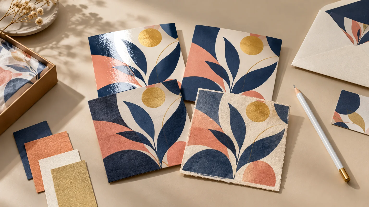
Matte, Gloss, Soft Touch, or Uncoated? Pick a Finish That Fits the Design
Choose gloss when vivid imagery and shine are part of the idea. Choose matte when you want restrained reflection and a polished surface. Choose soft touch when tactile presentation matters enough to justify an added coating or laminate. Choose uncoated stock when natural paper character, comfortable reading, or writing performance matters most.
That is the useful answer, but there is one important correction behind it: these four terms do not describe the same layer of a printed piece. Uncoated describes the paper substrate. Matte and gloss describe visual sheen and may come from coated stock, a coating, or a laminate. Soft touch is commonly a post-print film or coating. A specification that says only “matte” can therefore leave a production question unanswered. Domtar’s explanation of coated and uncoated paper is a helpful foundation for understanding that distinction.
TLDR: Match the finish to the job
- Pick gloss for photography, saturated graphics, promotional stickers, and pieces intended to look energetic or highly polished.
- Pick matte for controlled glare, sophisticated color, and designs that should feel polished without looking shiny.
- Pick soft touch for presentation cards, premium covers, folders, and packaging where the hand feel is part of the experience.
- Pick true uncoated stock for note cards, forms, appointment cards, reply cards, text-led pieces, and designs that benefit from visible paper texture.
- Request physical samples whenever color, fingerprints, writing, folding, foil, spot UV, or repeated handling could change the decision.
Compare the finishes by what the reader will experience
| Finish | Visual character | Tactile feel | Writing | Best fit |
|---|---|---|---|---|
| Gloss | Bright-looking color with strong reflections | Smooth and slick | Usually a poor choice for handwritten fields | Photography, promotional graphics, stickers, product imagery |
| Matte | Low sheen with controlled reflections | Smooth or lightly textured, depending on construction | Varies; matte does not automatically mean writable | Cards, brochures, packaging, refined brand pieces |
| Soft touch | Usually low sheen with a velvety presentation | Soft, suede-like, or velvet-like | Not the first choice for writing areas | Presentation covers, premium cards, folders, packaging |
| Uncoated | Low reflection with softer-looking color | Natural, porous, and paper-like | Generally the strongest option for writing | Stationery, forms, invitations, note cards, text-led print |
Treat this table as a design direction rather than a universal material specification. A matte-coated card and a matte uncoated sheet can both have restrained glare, yet behave very differently under ink, handwriting, folding, and handling. The printer’s named stock, coating, laminate, and production process determine the finished result.
Gloss favors visual impact
Gloss makes sense when the printed image should command attention before the reader studies the details. Coated surfaces limit ink absorption, which generally supports crisper reproduction and brighter-looking color than porous uncoated paper. The tradeoff is reflection: overhead lights, windows, and direct sun can create glare across text or dark areas.
Use it selectively. A photograph-led postcard, a bold promotional sticker, or a product card with rich color can benefit from shine. A long menu, instruction sheet, or densely written brochure may become harder to read as the viewing angle changes. Gloss also tends to make the surface itself more noticeable, so it can overpower a quiet, editorial design.
For sticker and label projects, consider the package as well as the artwork. A glossy label may reinforce a bright retail look, while a low-sheen label can feel calmer or more crafted. Start with the container, exposure conditions, and label hierarchy using our guide to designing product labels for the actual package. If custom vinyl stickers, labels, materials, and artwork preparation fit the project, view options.
Matte controls glare, but the word is incomplete
Matte is a visual description, not a guarantee of a particular paper or writing surface. A printer might offer matte-coated paper, a matte aqueous coating, a matte laminate, or an uncoated sheet marketed for its naturally low sheen. Ask which construction is being quoted instead of assuming every matte product will feel or perform alike.
A matte surface works beautifully when the design depends on readable type, restrained photography, muted elegance, or a soft contrast between ink and paper. It can also make packaging and cards easier to view under changing light. However, low glare does not automatically mean pencil- or pen-friendly. If recipients must complete a field, sign a card, or write a date, request a writing test on the exact material.
Soft touch makes tactility part of the design
Soft touch is chosen for the moment when someone picks up the piece. It is often supplied as a post-print coating or laminate rather than as the paper itself. For example, Drytac specifies one Soft Velvet Touch product as a 1.4 mil thermal laminating film with a velvet matte finish and lists covers, postcards, folders, brochures, calendars, and presentation covers among its applications. That specification describes one product, not every soft-touch system. Drytac’s technical data sheet shows why the exact film matters.
The finish can make a restrained design feel intentional without introducing gloss. It is particularly effective on presentation folders, business cards, invitation covers, short-run packaging, and other pieces handled before they are read. The design should leave room for that tactile effect; covering every surface with tiny copy or competing embellishments can dilute the point.
Do not assume soft touch is universally fingerprint-proof. Handling marks depend on the particular film or coating, the artwork, and the production system. Dark solid colors deserve a physical sample because fingerprints and scuffs are more visually disruptive when they break up a large, even field.
Foil and spot UV may be possible over some soft-touch films, but compatibility is process-specific. Ask the printer to confirm adhesion and registration on the proposed material, then approve a representative test rather than relying on a generic swatch.
Uncoated paper prioritizes paper character and writing
Uncoated stock has no surface coating, so its more porous surface absorbs more ink and reflects less light. Color usually appears softer than it does on a coated sheet, and very fine image detail may reproduce less crisply. Those qualities are not defects when the design is built for them. They can give invitations, stationery, inserts, and editorial pieces a natural, tactile presence.
This is often the best starting point when people need to write on the finished item. Think appointment reminders, RSVP cards, note cards, forms, loyalty cards, and package inserts with a handwritten message. Recipient-completed stationery particularly benefits from treating coated versus uncoated stock as a functional decision rather than a decorative afterthought.
Uncoated paper also suits text-led work because its low-reflection surface supports comfortable reading. The design must account for increased ink absorption, however. Fine reversed type, subtle shadow detail, and large dark solids may not behave as they would on a smooth coated stock. A confident uncoated design usually embraces the sheet instead of trying to imitate the punch of gloss.
Decide about writing before choosing the finish
A writing requirement can settle the entire comparison. If a card needs a signature, date, quantity, table number, personal message, or mailing notation, define that field during design—not after the order arrives.
- Specify what people will write with: pencil, ballpoint, gel pen, marker, or another tool.
- Mark the writing area on the artwork and keep heavy ink coverage away from it when possible.
- Ask whether the quoted “matte” option is truly uncoated, matte-coated, laminated, or coated after printing.
- Test drying, smearing, and legibility with the intended writing tool.
- Consider an uncoated reverse or dedicated writable panel when the front needs a coated visual finish.
This matters for invitations and cards as much as it does for forms. A suite can combine a polished invitation with an uncoated response card, giving each component the finish its task requires. That kind of coordinated material choice helps printed invitations, cards, and paper goods feel intentional rather than merely matching.
Proof color on the intended paper and finish
A screen cannot show surface reflection, paper texture, ink absorption, or the tactile character of a laminate. It also cannot guarantee an exact press result. Output profiles depend on the printer, ink, and paper combination, and gloss and matte papers can produce different color. Adobe’s guidance on print color profiles reinforces why the intended production combination matters.
For color-critical work, ask for a proof or production sample using the actual stock and finish. A generic coated swatch can help compare sheen, but it cannot reveal exactly how a dark brand color will look on your selected uncoated sheet or how a soft-touch film will affect a photograph.
Use this finish checklist when requesting a quote
- Name the printed product, final size, quantity, and how it will be handled.
- Identify the exact stock, including coated or uncoated construction and paper weight or thickness.
- State whether matte or gloss refers to the stock, a liquid coating, or a laminate.
- Describe any writing, glare, moisture, folding, scuffing, or repeated-handling requirement.
- List downstream effects such as foil, spot UV, die cutting, scoring, or binding.
- Request a physical sample when fingerprints, dark solids, color matching, or tactile quality could affect approval.
- Confirm the final specification on the proof and purchase order before production.
The best finish supports the purpose
If the piece is image-led and energetic, start with gloss. If it should look polished without conspicuous shine, investigate a clearly specified matte option. If touch is central to the first impression, price and sample a soft-touch laminate or coating. If writing, reading, or natural paper character leads the brief, start with uncoated stock.
Then test the choice against the actual design. View it under realistic light, handle the dark areas, write on the intended field, and compare color on the proposed production sheet. The right finish should not be an effect pasted onto the artwork. It should make the finished piece easier to use, more satisfying to hold, and more faithful to the idea.
References
- Coated vs Uncoated Paper – When To Use Which – Domtar
- MHL™
Soft Velvet TouchMHL™ Soft Velvet Touch i
- Soft Touch Lamination Film Manufacturer – KLBOPP
- Soft Touch Film & Velvet Lamination Film | Dunmore
- Coated vs Uncoated Cardstock for Invitations: What Actually Changes – PrintInvitations
- Choosing the Right Paper for the Right Job | Mohawk Connects
- Color profiles for print output in Photoshop | Photoshop