How to Build a Small-Business Print Kit That Looks Like One Brand
A small-business print kit looks cohesive when every piece follows the same visual rules without pretending every format has the same job. Keep the logo treatment, color hierarchy, typography, image style, shape language, and finish logic consistent. Then adapt scale, information density, material, and construction to the way each item will actually be handled.
That distinction matters. A product label must survive its container and communicate quickly. An insert can carry a longer message. A business card needs to feel intentional in the hand. An event sign has to work from several feet away. The goal is not to paste one layout onto six rectangles; it is to make six useful pieces sound like the same brand.
Quick answer: build a system before ordering products
Start with a compact print system: one primary logo arrangement, one alternate mark, a controlled color palette, two or three text styles, a repeatable spacing rule, a defined image or illustration treatment, and a short list of approved finishes. Apply those decisions to a minimum viable kit, proof the pieces together, and expand only after the essential formats work.
- List the physical moments where customers meet the brand.
- Choose only the printed pieces that improve those moments.
- Define the visual elements that must remain constant.
- Match each piece to its handling conditions and information load.
- Prepare production files using one shared naming and approval system.
- Proof the kit as a family, not as isolated products.
Decide what belongs in the kit
A useful kit begins with the customer journey, not a print catalog. Map the moments from discovery to purchase, delivery, repeat order, and in-person interaction. A market-based food brand might need product labels, package seals, price cards, and a small care or ingredient insert. A consultant might prioritize business cards, presentation folders, note cards, and event handouts. An online shop may get more value from shipping labels, thank-you cards, return instructions, and branded stickers.
Give each piece one primary responsibility. If every item repeats the full brand story, the kit becomes crowded and expensive. Let the label identify the product, the insert explain the next step, the sticker add recognition or delight, and the event piece attract attention. Repetition should come from the visual system, not from duplicating every sentence.
| Print piece | Primary role | Design priority | Production check |
|---|---|---|---|
| Product label | Identify and explain the product | Fast hierarchy at actual size | Fit, adhesion, legibility, and container interaction |
| Brand sticker | Seal, promote, or reward | Recognizable mark with minimal copy | Material, opacity, finish, and intended surface |
| Business or contact card | Make follow-up easy | Readable contact path and tactile confidence | Stock, coating, trim, and writing needs |
| Package insert | Explain, thank, or guide | Clear sequence and restrained message length | Package fit, curl, visibility, and packing speed |
| Packaging band or seal | Unify a plain container | Strong shape and simple brand cue | Tension, overlap, closure, and handling |
| Event card or sign | Communicate at a distance | Large message and immediate action | Viewing distance, glare, support, and transport |
Create visual constants, then allow controlled variation
Choose a few elements that will survive every format. The most dependable constants are usually a core color relationship, a typographic hierarchy, a recurring edge or shape treatment, and a consistent approach to imagery. For example, a brand might pair a deep neutral with one bright accent, use a bold sans serif for short headlines, place information inside softly rounded frames, and crop all photographs closely.
Do not make the logo do all the work. A coordinated print family should still feel related when the logo is small or absent. Color proportions, margins, illustration style, icon weight, and writing tone can create stronger recognition than an oversized mark on every piece.
Controlled variation keeps the system useful. Your event sign may use the accent color across half the surface, while a product label reserves it for flavor or size identification. A premium card might use generous empty space, while a small package seal needs a bolder mark. These are changes in emphasis, not changes in identity.
Build a finish strategy instead of choosing effects one by one
Material and finish decisions should express one brand idea. A natural, tactile system might combine uncoated cards, textured paper inserts, and matte labels. A vivid retail brand might use smooth stocks, saturated color, and selective gloss. A minimal technical brand could rely on crisp white material, restrained color, and precise geometric details.
This does not mean every piece needs the same substrate. Labels are material systems, not simply printed paper. Avery describes a pressure-sensitive label as a combination of facestock, adhesive, liner, and, where applicable, a protective topcoat. Its guide to label construction is a useful reminder that the visible design is only one part of the product.
Choose label material and adhesive for the surface and environment. Paper, clear film, white film, waterproof vinyl film, foil paper, and metallic film can create very different results. Permanent and removable adhesives also serve different purposes, and removable options may be less effective on some curved, water-resistant, scratch-resistant, or low-surface-energy surfaces. Test the actual package rather than approving the label as a flat graphic. The guide to designing labels for the real package explains how size, hierarchy, material, and container conditions work together.
For the sticker and label portion of a kit, CustomStickers for custom stickers, labels, and vinyl materials is a practical ordering path. Its classic vinyl product is offered in matte or gloss, and its white vinyl is described as opaque rather than transparent; those specifications are product-specific, so match them to the intended surface and appearance.
Use special effects selectively. Foil, spot gloss, white ink, and other embellishments are most convincing when they reinforce hierarchy rather than decorate every available space. They can also require separate production data. For example, MOO's published special-finish workflow calls for vector PDF artwork and a separate black-and-white finish mask. Ask the chosen printer how masks, spot colors, white layers, and overprint settings must be supplied before finalizing the design.
Design each piece at its real size
A print kit can look immaculate on a large monitor and fail in the hand. Review every item at 100 percent scale. Small labels need ruthless hierarchy. Inserts need comfortable reading sizes. Event materials need a message that remains clear from the expected viewing distance. Long URLs, dense social handles, legal copy, and product instructions can quickly overwhelm compact formats.
Print rough paper prototypes, trim them, and place them where the finished pieces will go. Wrap the label around the bottle or box. Put the insert inside the mailer with the product. Hold the card at a natural reading distance. Arrange the event materials on a table. This simple rehearsal reveals awkward scale, hidden information, excessive repetition, and pieces that slow down packing.
For inserts, check more than appearance. A full-size in-package proof should be evaluated for visibility, curl, fit, product contact, and speed of placement in the actual fulfillment sequence. Folded cards introduce additional production considerations, including scoring, folding, panel alignment, packing orientation, and crease quality. A flat card is often the cleaner choice when the message fits comfortably on two sides.
Prepare one production architecture for the whole kit
Cohesion can be lost between design and production if files are built independently. Create shared color definitions, paragraph and character styles, logo assets, image treatments, and export presets. Keep dimensions, substrate, color system, finishes, version, and approval status in a production record for every item. A production PDF should remain distinct from a lightweight visual-reference PDF.
Use bleed wherever artwork is intended to reach a trimmed edge. Adobe explains that bleed extends artwork beyond the trim to help prevent white gaps caused by cutting variation. It gives 0.125 inch, or 3 mm, as a common example while noting that providers may require more. Confirm the specification for each product rather than applying one assumption across the kit. Adobe's print-bleed guidance provides a clear overview.
Run a preflight before uploading files. Adobe InDesign can flag issues such as missing fonts, modified links, overset text, and low-resolution images. Its packaging workflow can collect the document, linked graphics, eligible fonts, a report, and an optional print-ready PDF. Adobe's file-packaging documentation is useful when a designer must hand editable work to another production partner.
File discipline is especially important when six products generate several proofs each. Use meaningful product, size, version, and status fields instead of names such as final-final-new.pdf. A consistent approach to version names for print projects reduces the chance that an obsolete proof becomes the production file. For a larger handoff, follow a structured packaging artwork checklist covering dielines, fonts, links, finish masks, production notes, and approvals.
Proof the print kit as one physical family
Reviewing each proof separately can hide inconsistencies. Place the pieces side by side in the order a customer might encounter them. Check whether the same black appears unexpectedly warm on one stock and cool on another, whether the accent color dominates one product, whether corner shapes and border weights drift, and whether logo clear space remains consistent.
Also compare tactile and reflective qualities. A matte label beside a high-gloss insert may feel disconnected even when their colors match. That contrast can be intentional, but it should have a reason. Material samples are valuable because screen previews cannot show stiffness, texture, coating, opacity, or glare. FedEx Office, for example, positions its print sample kit as a way to evaluate products, materials, and finishes in hand.
Worked example: a coordinated launch kit
Imagine a small botanical body-care brand preparing a product launch. Its core system uses warm cream, dark green, and one flower-inspired accent color. Headlines use a high-contrast serif; instructions use a restrained sans serif. A thin botanical line drawing appears as a secondary device, and finishes stay predominantly matte.
The jar label gives the product name the strongest position, keeps required details legible, and uses the accent color to distinguish varieties. The package seal reduces the design to the alternate mark and botanical line. The thank-you insert uses more white space and explains care, reuse, or reorder information. A small event card enlarges the product benefit and purchase action so it can work from across a table.
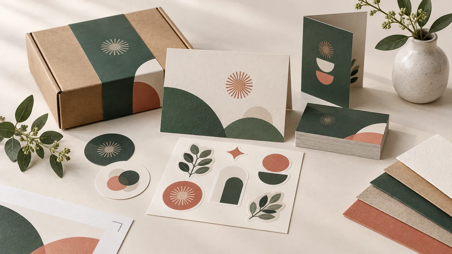
These pieces are not identical. The information, scale, and proportions change, but the color relationship, typography, illustration, and finish logic remain stable. That is the test of a real brand system: it produces recognizable variation instead of repetitive layouts.
Small-business print kit production checklist
- Every piece has one clearly defined job.
- Logo variants and minimum-use rules are consistent.
- Color definitions are shared across source files.
- Typography uses the same approved families and hierarchy.
- Image crops, illustration weight, and icon style feel related.
- Materials suit the actual surface, handling, moisture, and writing needs.
- Matte, gloss, texture, foil, and other finishes follow one deliberate logic.
- Labels have been fitted and tested on the actual containers.
- Inserts have been tested inside the complete packed order.
- Bleed, trim, safe areas, folds, and dielines follow provider specifications.
- Finish masks and white-ink layers use the printer's required setup.
- Fonts, links, image resolution, and overset text have been preflighted.
- Filenames distinguish working, proof, approved, and production versions.
- Physical or full-size proofs have been reviewed together as a complete kit.
- One person has recorded final approval for every item and version.
Start with the smallest kit that completes the experience
For most small businesses, I would begin with three to five pieces tied to the most important customer interaction. An online product brand might start with its product label, package seal, thank-you insert, shipping identifier, and one promotional sticker. A service business may need only a card, appointment piece, presentation sheet, and event handout.
Define the shared system, make full-size prototypes, and request material samples before committing to the complete run. Once those first pieces work together physically, document the decisions in a one-page print standard. Future menus, postcards, packaging, and event materials can then grow from an established brand language instead of restarting the design process with every order.
References
- What Makes Up a Label? | Avery.com
- Blank Sheet and Roll Label Materials | Avery
- Avery Label Adhesion | Avery
- Custom Vinyl Stickers | Waterproof and Durable – CustomStickers.com
- Special Business Card Finishes | Foil | Spot UV
- Cardstock Insert vs Flyer vs Folded Card for Product Packaging – Midea Home
- Packaging File Handoff: What a Designer Should Send With the Final Artwork – Midea Home
- Adobe Learn – Learn InDesign – Set a print bleed
- Package InDesign files for output | InDesign
- Print Sample Kit | Explore Print Products & Materials | FedEx Office