Appointment Reminder Cards: Keep the Useful Information Larger Than the Branding
TLDR: Give the appointment date and time the largest, clearest area on the card. Follow them with the service or provider, location or appointment mode, and one simple rescheduling route. Keep branding recognizable but secondary. For most service businesses, a double-sided, wallet-friendly card with a branded front and a light, writable back is the strongest starting point.
Effective appointment reminder card design treats the card as an operational tool, not a miniature advertisement. A client should be able to glance at it and answer four questions immediately: When is the appointment? What is it for? Where does it happen? How do I change it?
That priority sounds obvious, yet it is easy to lose when a large logo, decorative typography, promotional offer, QR code, social handles, and contact details all compete for the same few square inches. Visual hierarchy works by making the most important information the most prominent. On this card, the next appointment—not the brand—is the most important information.
Appointment reminder card design starts with five levels
Before selecting colors or typefaces, rank the content. A useful appointment card generally needs five levels of information, and the visual weight should follow the same order.
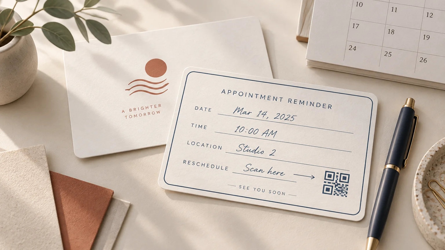
- Date and time: Make these the fastest details to locate. Use clearly labeled writing fields and enough contrast for both printed and handwritten information.
- Appointment context: Identify the service, staff member, department, or appointment type when that information helps the client prepare or arrive correctly.
- Location or appointment mode: Include a concise address, room, branch, phone instruction, or indication that the meeting is online. Avoid squeezing a complicated set of directions onto the card.
- Rescheduling route: Give the client one primary action, such as calling a number, visiting a short URL, or scanning a QR code. State any relevant cancellation instruction in plain language.
- Business identity and optional promotion: Include the logo and essential brand cues, but place social handles, referral offers, slogans, and loyalty features only where they do not interfere with the reminder.
A simple test is to cover the logo and ask whether the card still performs its job. Then cover the appointment block and ask whether the remaining design is useful. If the second version looks polished but cannot remind anyone of an appointment, the hierarchy is backward.
Choose the card structure around the task
A compact card is often convenient because it can fit in a wallet, cardholder, purse pocket, or front-desk organizer. Some commercial appointment-card products use business-card-like formats, but those dimensions and available stocks are vendor-specific rather than universal standards. Start by asking how much operational information the client genuinely needs, then request the printer’s template for the selected format.
| Card structure | Best fit | Main design priority | Watch for |
|---|---|---|---|
| Dedicated reminder card | Salons, clinics, tutors, studios, and recurring services | A large writable appointment block | Too much unused branding on the reminder side |
| Business card and reminder hybrid | Independent professionals who need identity and scheduling in one piece | Clear separation between evergreen contact details and changing appointment details | A front that tries to function as both an advertisement and a form |
| Reminder and loyalty card | Businesses with a simple repeat-visit program | Distinct zones for appointments and stamps or marks | Crowding, confusing marks, and too little writing room |
| Preprinted variable card | Operations that generate appointment details digitally | Readable personalization and reliable data placement | Long names, multiple locations, and other variable text overflowing |
| Card plus supplemental sticker | Businesses that need to update a date, branch, booking route, or campaign | A sticker sized for a deliberate blank area | Layering labels over essential text or creating an awkward writing surface |
If the message needs substantial instructions, a map, preparation steps, several policies, or multilingual copy, a tiny flat card may be the wrong structure. A larger flat piece or folded card provides more breathing room; this flat-card versus folded-card comparison can help when the information no longer fits comfortably.
Supplemental labels are useful when information changes independently of the base card. For example, a business could leave a defined blank zone for a branch-specific booking label rather than reprinting the whole design. If that system suits the workflow, explore appropriately sized custom stickers and labels and test the finished surface before committing to a full quantity.
Design the writable side for real handwriting
A reminder card is often completed while a client is standing at a counter, speaking to a receptionist, or gathering belongings. The writing surface must work under those ordinary conditions. A pale or white field makes handwritten entries easier to read, while generous rules or boxes reduce ambiguity between the date and time.
Do not assume every attractive finish accepts every pen. Heavy gloss, lamination, foil, texture, and dark ink coverage can make writing slower, less legible, or more prone to smearing. Keep special finishes on the branded side or outside the writing zone unless the printer has confirmed compatibility.
The safest production test is refreshingly simple: obtain a printed sample and write on it using the pen that will actually sit at the checkout desk. Test quick handwriting, wait a few seconds, rub a finger across the entry, and place the card in a wallet or pocket. This is a proposed proofing method, not a claim about any particular stock or coating.
Use typography that survives hurried reading
Appointment cards are small, but that does not mean every element should be small. Reserve the strongest weight or largest size for the date and time labels. Use a straightforward typeface for operational information, maintain strong contrast, and avoid long runs of uppercase text. Decorative typography can support the brand name or a short heading without carrying the details a client must act on.
Plan for worst-case entries rather than the neatest example in the design mockup. “May 2” takes little room; “Wednesday, September 24” takes much more. A short staff name may fit perfectly while a longer provider or service name wraps. Fill the fields with realistic long entries before approving the layout.
Printed labels such as “DATE,” “TIME,” and “WITH” should remain visibly separate from handwriting. A thin blank line can disappear beneath rushed pen strokes, so a lightly tinted box or a label positioned above the entry area is often clearer.
A practical double-sided content example
For a broad range of salons, wellness studios, consultants, repair services, tutors, and other scheduled businesses, I would begin with the following structure.
Front: recognizable but restrained
- Business name and logo
- Short service descriptor, if the name does not explain the business
- Primary phone number or concise web address
- Brand color, pattern, illustration, or finish used with restraint
Back: the working reminder
- YOUR NEXT APPOINTMENT
- Date:
- Time:
- Service or provider:
- Location or appointment mode:
- Need to change your appointment? Call 555-0142 or visit example.com/change.
That final instruction should be concise and specific. “Contact us if needed” makes the client decide how to proceed. “Call this number to reschedule” gives a defined next action. If multiple channels exist, select the route the business can maintain reliably instead of printing every possible contact method.
Add a QR code only when it removes friction
A QR code earns its space when it opens a useful destination: a booking-change page, directions, an intake form, an online meeting route, or a calendar action. It should not be added merely to make the card appear modern.
Keep a readable fallback beside it, such as a phone number or short URL. A client may not want to scan, may have limited connectivity, or may be reading the card on the same device needed to open the destination. The fallback also makes the card understandable without explaining what the code does.
Use a short action label such as “Scan to reschedule” rather than an unexplained code. Test the printed proof with multiple ordinary phones and under realistic lighting. Testing the design on screen is not enough because physical size, contrast, finish, trimming, and surrounding artwork can affect practical scanning.
Prepare the file for trimming and production
The printer’s template is the controlling specification. Do not add a generic bleed measurement and assume it applies everywhere. As one concrete example, Adobe illustrates a 3.5 × 2-inch business card supplied at 3.75 × 2.25 inches when 1/8-inch bleed is required on every side. That example explains the calculation, but it does not replace the requirements of the printer producing your card.
Extend background colors and images to the bleed boundary while keeping names, phone numbers, writing rules, and QR codes safely inside the trim. Small shifts are more noticeable when a border sits close to an edge, so consider whether a full-bleed field is more forgiving than a thin frame.
Before export, use this compact production checklist:
- Download the printer’s current template for the exact format and orientation.
- Confirm final trim, bleed, and safe-area requirements.
- Check that background artwork reaches the required bleed boundary.
- Keep essential text, writing fields, and codes away from the trim.
- Use images that meet the printer’s effective-resolution requirement at placed size.
- Resolve missing fonts, broken links, and overset or hidden text.
- Confirm the requested color mode and printer color profile.
- Proof both sides at actual physical size, not only at a comfortable screen zoom.
- Verify that front and back orientations match the intended flip direction.
- Export in the printer’s requested PDF or artwork format and inspect the exported file.
Adobe’s guidance for producing print-ready PDFs likewise calls for checking missing fonts, low-resolution images, overset text, bleed and margin settings, and the printer’s color-profile requirements. Its print-ready PDF guidance for InDesign is a useful preflight reference, while the selected printer remains the final authority for submission settings.
Use disciplined filenames during review so an obsolete proof does not become the production file. A project name, format, side or version indicator, date, and approval status are more useful than “final-final.” The site’s print-project version naming guide provides a practical handoff system.
Handle health-care reminders with additional care
Health-care organizations should keep reminder cards appropriately discreet and obtain compliance guidance specific to their organization and circumstances. The U.S. Department of Health and Human Services states that appointment reminders can be treatment communications under HIPAA, while also requiring reasonable safeguards and limited disclosure. Its examples show that the appropriate communication method can depend on a patient’s confidential-communication request.
This is not a reason to turn a small card into a legal notice. It is a reason to avoid unnecessary sensitive detail, review what appears on an exposed card, and have the organization’s privacy or compliance lead approve the content and delivery method.
Proof the useful information before polishing the brand
The strongest next step is to print the layout at actual size on an office printer, cut it out, and complete every field by hand. Ask someone unfamiliar with the design to find the date, time, location, and rescheduling route. If any answer takes more than a quick glance, adjust the hierarchy before discussing premium finishes.
For most projects, start with a double-sided, wallet-friendly card: a restrained branded front and a light, writable reminder back. Keep the date and time dominant, provide one clear way to change the booking, confirm production specifications with the printer, and test the real card with the real pen. When those practical details work, the branding feels more polished—not less—because the finished piece does its job.
References
- How to design a poster: Beginner's guide | Adobe
- Appointment Cards – Design & Print Appointment Reminder Cards
- Bleeds for Print
- Produce print-ready PDF files in InDesign | InDesign
- May physician's offices or pharmacists leave messages for patients at their homes, either on an answering machine or with a family member, to remind them of appointments or to inform them that a prescription is ready? May providers continue to mail appointment or prescription refill reminders to patients' homes? | HHS.gov