Flat Card vs Folded Card: Which One Fits the Message?
TLDR
For flat card vs folded card printing, choose a flat card when the message should be seen immediately, the piece needs to fit neatly into packaging, or the design has one clear visual job. Choose a folded card when you want a cover-and-reveal experience, more writing room, or separate panels for different parts of the message. Neither format is automatically more elegant or more economical; the right choice depends on content, artwork, stock, finishing, assembly, and mailing requirements.
The most useful way to settle the flat card vs folded card printing decision is to ask how the recipient should experience the piece. Should they understand it at a glance, or should opening the card be part of the message? That distinction matters more than tradition. A striking flat invitation can feel wonderfully formal, while a restrained folded note can feel warm and personal.
Flat card vs folded card printing at a glance
| Decision factor | Flat card | Folded card |
|---|---|---|
| Structure | One panel with a front and back | Multiple panels created by a fold |
| Best for | Save-the-dates, package inserts, announcements, promotional cards, art-led pieces | Greeting cards, personal notes, client appreciation cards, invitations needing a reveal |
| Message sequence | Everything important can be presented immediately | A cover introduces the message before the interior completes it |
| Writing space | Usually a defined area on the front or back | Typically offers a larger protected interior area |
| Artwork setup | Front and back require coordination | Cover, interior panels, back, fold position, and panel orientation must align |
| Production concerns | Stock, trim, bleed, coating, and two-sided alignment | All flat-card concerns plus scoring, folding, grain direction, and fold-sensitive artwork |
| Mailing | Can be compact, but postal treatment depends on the complete mailpiece | Usually mailed in an envelope; final thickness and rigidity depend on the full assembly |
| Display | Easy to pin, frame, stack, place in a package, or prop in a holder | Can stand on a surface when its dimensions and fold support the design |
| Budget | Depends on size, stock, sides printed, finish, quantity, envelopes, and fulfillment | Depends on the same variables plus any scoring, folding, assembly, or additional printed area |
A flat card communicates with speed. Its strongest image, headline, or essential information is immediately available. A folded card controls pace: the outside creates anticipation, and the inside provides the answer, message, or details.
Choose the structure around the message
Start by editing the content before selecting a size or finish. If the card has one primary job—say thank you, announce a date, provide care instructions, or deliver a discount code—a flat format is often the clearest solution. It encourages concise copy and a strong hierarchy.
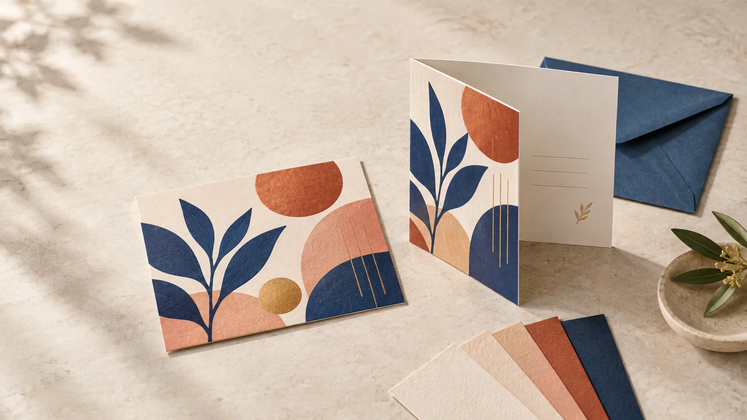
A folded card becomes useful when the content has distinct stages. The cover can carry a name, image, or short greeting; the interior can hold a longer note, event details, signatures, or handwriting. The structure gives each element room rather than forcing everything onto one crowded surface.
Do not use a fold merely to accommodate copy that has not been edited. Extra panels can make weak hierarchy harder to navigate. Conversely, do not compress a personal message into tiny type just to keep the piece flat. Format should support the content rather than fight it.
Presentation: immediate impact or an opening reveal
Flat cards work particularly well when the artwork itself is the event. A bold illustration, photograph, typographic announcement, or branded pattern can occupy the full face of the piece. The reverse can then carry supporting information, provided recipients will know to turn it over.
Folded cards create a small ceremony. The recipient sees the cover, handles the piece, and opens it to discover the interior. This sequence suits greetings, appreciation notes, milestone announcements, and invitations where the reveal contributes to the mood.
That does not make folded cards universally more premium. Visual impact comes from proportion, typography, paper, printing, finishing, and restraint. A beautifully spaced flat card on a well-chosen stock can feel more intentional than an overfilled folded design. Printed pieces also have value because they can be held, saved, displayed, and included in a larger physical experience; this look at why printed invitations and paper goods still matter explores that role in more detail.
Plan the artwork panel by panel
A flat card usually has two design surfaces: front and back. Decide whether the back is part of the reading sequence or simply supports the front. If critical instructions appear only on the reverse, add a subtle cue or make the card’s purpose obvious enough that turning it over feels natural.
A folded card may include a front cover, back cover, inside-left panel, and inside-right panel. Their orientation in the production file may not look intuitive, especially when a printer supplies artwork as a spread. Always use the provider’s product-specific template instead of creating a fold line from assumption.
- Keep names, small text, faces, borders, and other critical elements away from the fold and trim zones specified by the printer.
- Extend backgrounds and images through the required bleed area rather than stopping them at the finished edge.
- Check the inside and outside spreads separately, then review a mock-up in its folded reading order.
- Confirm whether blank panels must still appear in the supplied artwork file.
- Ask whether the cards arrive folded, scored but flat, or completely flat for customer assembly.
Before submission, follow a consistent file-preparation process. The guidance on preparing artwork for custom printing covers practical checks such as dimensions, bleed, image quality, color, and proof review.
Why folded cards need extra production attention
Folding introduces mechanical stress. Paper characteristics, grain direction, printed coverage, coating, and the production process can all influence the result. Neenah’s folding-board production guidance recommends scoring and folding with the paper grain where possible and pretesting because scoring requirements vary by stock and process.
This is especially important when artwork crosses the fold. A dark solid, delicate line, photograph, foil detail, embossed element, or tightly positioned border can make a small variation much more visible. Rather than assuming a fold will land perfectly through a critical feature, redesign the feature with tolerance around the crease.
A physical proof or production sample is valuable when the fold is central to the design, the stock is unfamiliar, or the project includes dense ink coverage or special finishing. A digital proof can verify content and general placement, but it cannot fully demonstrate how a particular stock will bend, how a finish will respond, or how the assembled piece will feel in the hand.
Design a writing surface intentionally
If recipients or senders will write on the card, do not treat that area as leftover space. Reserve enough room for the expected message, use a light or unprinted background, and select type and artwork that will not compete with handwriting.
Staples’ product-specific flat-card guidance recommends leaving white or light-colored space for handwriting and identifies matte stock as the better writing surface within that particular card range. That is useful direction, but it is not a universal guarantee. Writing performance varies with the exact paper, coating, ink, and pen.
For an important run, request a sample of the chosen stock and test the actual pen that will be used. Check drying time, smudging, skipping, feathering, and contrast. If several people will sign the cards, test more than one common pen rather than relying on a single preferred instrument.
Treat mailing as a complete-assembly decision
A card cannot be assessed for mailing in isolation. The envelope, inserts, closures, ribbon, belly band, wax seal, dimensional decoration, thickness, weight, and flexibility all contribute to how the finished mailpiece is classified and processed.
USPS classifies letter-size mail using factors including dimensions, thickness, shape, flexibility, weight, and preparation. Its published maximum dimensions for letter-size pieces are 11½ by 6⅛ by ¼ inch, while pieces seeking First-Class Mail card pricing face stricter requirements, including a maximum thickness of 0.016 inch. These classifications are not determined solely by whether the printed card began as a flat or folded format.
USPS also advises that envelopes intended for high-speed sorting remain flat and flexible. Rigid or uneven contents and embellished invitations may require nonmachinable handling or an outer envelope. Before ordering a large mailed run, assemble one complete piece exactly as the recipient will receive it. Weigh it, measure it, check its flexibility, and take it to the relevant postal service for current guidance.
For invitation suites, consider the entire set rather than choosing the main card in isolation. A flat invitation can carry essential event details, while separate enclosures can handle responses, directions, or supporting information. Components may also be organized as a coordinated suite with a belly band. If the project is invitation-led, reviewing custom invitation printing can help frame the card as one part of the complete stationery set.
Which format fits common card projects?
Package inserts and care cards
Choose flat in most cases. The card can sit neatly above or beside the product, and the customer can scan instructions, a thank-you message, or a next step without unfolding anything. Size the insert for the actual package, keep it readable, and reserve room for a handwritten note when that adds genuine value. A folded insert makes sense when necessary instructions cannot be edited into a clear front-and-back layout, but confirm that its added bulk will not disrupt the packaging.
Save-the-dates and announcements
Choose flat when the date, names, and essential action should register immediately. A strong image on one side and concise details on the other usually provide enough structure. Choose folded only when the announcement benefits from a cover reveal or a substantial personal message.
Greeting and appreciation cards
Choose folded when handwriting is central. The cover can establish the tone while the interior protects a longer note and multiple signatures. Choose flat for a brief, modern thank-you or an art card where the printed image deserves uninterrupted attention.
Invitations
Either format can work. A flat invitation is effective when event information is concise or when additional details belong on separate enclosure cards. A folded invitation can organize a longer program or create a deliberate reveal. Do not add panels simply to make the invitation appear formal; use them when they improve reading order.
Promotional and art-led cards
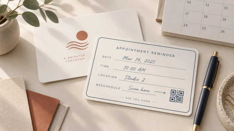
Choose flat when the image, offer, QR code, or message must be noticed quickly. The format is easy to hand out, place in an order, or display. A folded promotional card is more appropriate when it functions like a miniature brochure and the content has a clear sequence.
Do folded cards always cost more?
No universal price rule applies. A folded card may require scoring, folding, more printed area, or additional setup, but actual pricing depends on the complete specification. A specialty flat card with premium stock and multiple finishes could cost more than a simple folded card.
Request comparable quotes using the same finished quantity and equivalent requirements. Specify the open and closed size, paper, printed sides, ink coverage, finish, score and fold, envelopes, proofing, assembly, packaging, shipping, and deadline. This specification-first guide to ordering printing online can help you prepare a cleaner quote request and catch missing production details.
Final format checklist
- Can the complete message be understood immediately, or should it unfold in stages?
- Does the recipient need a generous or protected writing area?
- Will important artwork, typography, or finishing cross the fold?
- Has the printer supplied the exact template, bleed, safe area, fold position, and panel order?
- Will the finished piece go inside packaging, an envelope, or a larger invitation suite?
- Have you tested the intended pen on the selected stock and finish?
- Have you reviewed a physical sample when folding or finishing is visually important?
- For mailed pieces, have you built, weighed, measured, and checked one complete assembly?
- Are you comparing quotes with matching specifications rather than format names alone?
Make the structure serve the experience
Choose a flat card when the piece has one clear job and should communicate it at once. Choose a folded card when opening is part of the experience, the message needs more room, or separate panels create a more natural reading sequence.
Then prototype the real object. Print a paper mock-up at full size, trim it, fold it if needed, write on it, place it in its package or envelope, and read it in the intended order. That simple test will reveal whether the format supports the message before paper, finishing, and production quantities turn the decision into a costly commitment.
References
- Neenah Folding Board_Production
- Signature Flat Cards | Staples®
- 201 Quick Service Guide | Postal Explorer
- How to Send a Letter or Postcard | USPS
- Custom Printed Invitations for Business Events: What to Include Before You Print – PrintInvitations
- How to Put Together Wedding Invitations With a Belly Band – PrintInvitations
- Packaging Inserts Customers Actually Read – CustomStickers.com