Front Label vs Wrap Label: Which Layout Fits the Package?
TLDR
Choose a front label when the package needs one strong shelf-facing message, the container has limited flat space, or labels will be applied by hand. Choose a pressure-sensitive wrap label when the vessel has a smooth, consistent label path and the product genuinely needs more information space. A separate front-and-back system is often the best middle option: it creates a clean brand panel in front and a practical information panel behind without introducing a long wrap seam.
The central decision in front label vs wrap label packaging is not which dieline gives you the largest canvas. It is which format fits the physical container, protects the information hierarchy, applies consistently, and can be repeated across every product variant.
Front-only, front-and-back, and wrap labels defined
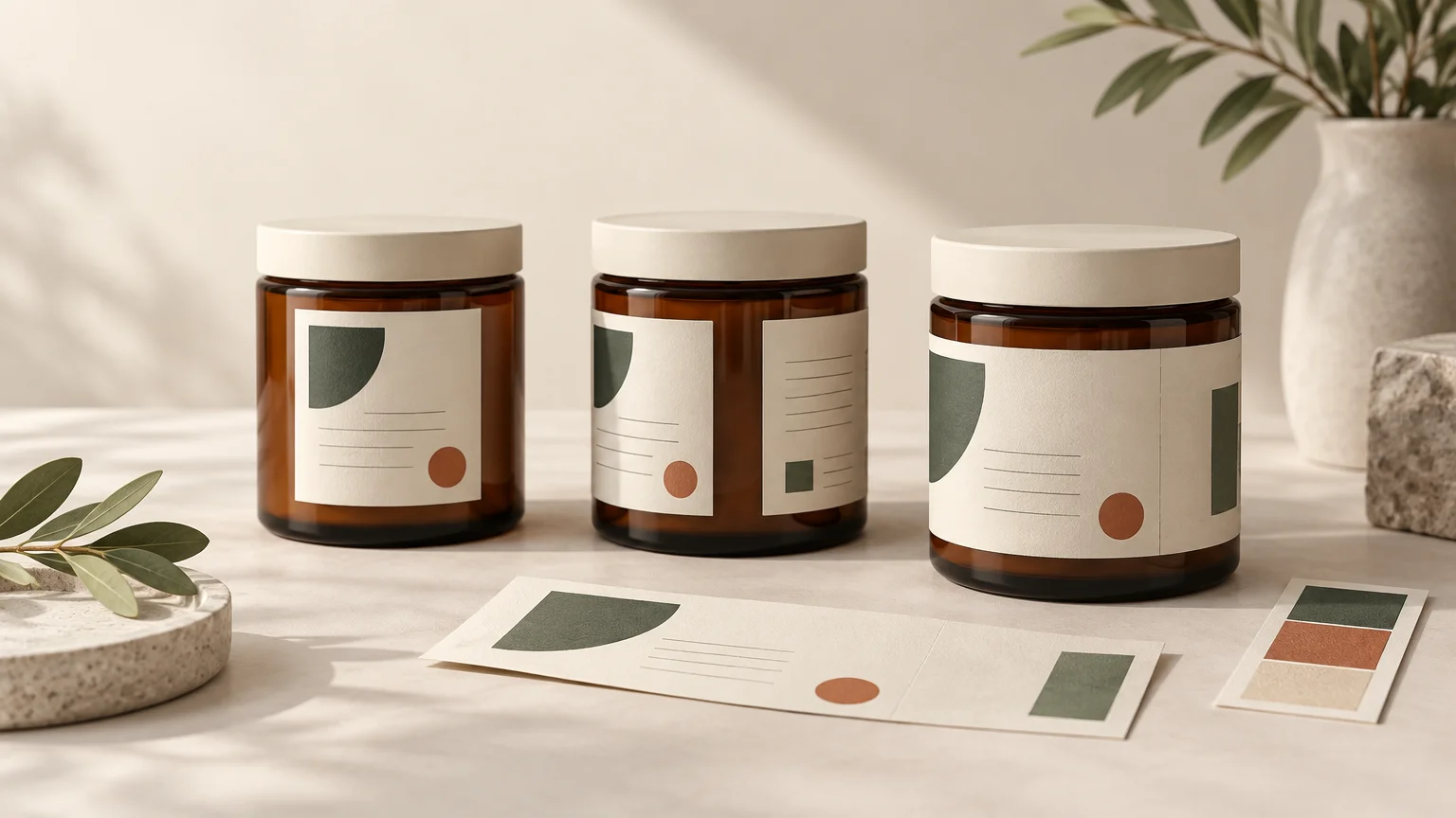
A front-only label occupies the main display area of a bottle, jar, tin, box, or pouch. It usually carries the brand, product name, variant, and a limited set of supporting details. The remaining package surface stays visible or carries information elsewhere.
A front-and-back system uses two separate labels. The front label handles recognition and visual impact; the rear label holds ingredients, directions, warnings, contact information, or other secondary content. The two labels do not have to match in size, but they should look like parts of one system.
A pressure-sensitive wrap label travels around a substantial portion of the container. It may leave a narrow uncovered gap or use a controlled overlap, depending on the package, label construction, and converter's specifications. This article does not treat shrink sleeves as wrap labels; sleeves use a different production and application process.
| Format | Best fit | Information capacity | Shelf effect | Application | Container tolerance |
|---|---|---|---|---|---|
| Front-only | Focused branding and short copy | Low to moderate | Strong, deliberate front panel | Usually calmer for hand placement | Can work around shoulders, taper, or limited smooth areas |
| Front-and-back | Branding plus substantial secondary information | Moderate to high | Clean front with an organized rear panel | Two placements, but each label is easier to control | Useful when front and rear have distinct usable panels |
| Partial or near-full wrap | Long copy, instructions, storytelling, or multilingual content | High | Continuous visual system when aligned well | More sensitive to rotation, level, and seam consistency | Best on smooth, predictable label paths |
Let the container choose the label architecture
Begin with the final production container, not a supplier photograph or an estimated diameter. Hold it as a customer would and identify the area most likely to face forward. Then inspect the intended label height for straight walls, taper, shoulders, ribs, texture, molded seams, embossing, and abrupt changes in curvature.
A technically round bottle is not necessarily suitable for a long rectangular wrap. If the wall narrows toward the shoulder or base, the label may be asked to follow two different circumferences. That can create lifting, wrinkles, or a visibly crooked edge. A smaller front label may sit more cleanly within the vessel's usable smooth panel.
For a more complete package-first workflow, use this guide to design product labels around the actual container. The important production measurement is not simply the package's maximum width or circumference; it is the smooth, stable path available at the exact height where the label will sit.
How to measure a prospective wrap area
- Place a flexible paper strip around the intended label position without forcing it over shoulders, ribs, or other changing geometry.
- Mark where the strip meets and measure that length flat. Repeat near the top and bottom of the proposed label area to reveal taper.
- Measure the usable label height between major curves, ridges, seams, or textured sections.
- Decide whether the design requires an uncovered gap or an overlap, then obtain the converter's limits before finalizing the width.
- Create a full-size paper mockup and place it on the real container. Check the front-facing zone, rear reading area, edge alignment, and seam position.
- Ask the printer for its final dieline and tolerances before preparing production artwork. Do not build the print file from the mockup measurement alone.
Front label vs wrap label packaging is an information decision
More printable area is useful only when it improves communication. A wrap crowded with decorative copy can make the product harder to understand than a disciplined front label. Start by separating content into three levels: what must be recognized immediately, what helps the purchase decision, and what can be read after the package is picked up.
The deliberate front-facing zone should normally contain the brand, product identity, variant cue, and the most important qualifying statement. Ingredients, directions, extended descriptions, company information, and other secondary material can move to a rear or side zone when applicable.
Treat a wrap as a sequence of panels rather than one panoramic poster. Establish front, side, rear, and seam zones in the artwork. Keep small type, barcodes, essential directions, and other critical content away from a seam, overlap, or uncovered gap. The precise clearances should come from the printer's dieline and the expected application tolerance.
For regulated products, a larger wrap does not remove content or placement obligations. In relevant U.S. dietary-supplement labeling, for example, the FDA distinguishes the principal display panel from information panels based on how the package is displayed and examined in customary retail conditions. Requirements vary by product and jurisdiction, so verify the rules that apply to the specific category and market through the FDA dietary-supplement labeling guidance or the appropriate regulator.
Consider shelf appearance from more than one angle
A front label acts like a framed composition. It can create a premium, restrained effect because the container itself remains part of the design. This is particularly effective when the glass, product color, paper texture, or vessel finish contributes to the brand.
A wrap creates a more controlled branded surface. It can support illustrations, instructions, flavor stories, patterns, or multilingual copy, but rotation matters. If containers land on the shelf at slightly different angles, the design should still look intentional. Avoid placing an important word or face so close to a side transition that a small rotation makes it appear accidentally cropped.
Clear labels introduce another layer: the package, product, adhesive, and anything visible through the opposite side can affect the artwork. If transparency is central to the concept, plan white ink and open areas deliberately rather than assuming the digital file's white background will print. See the detailed guide to designing white ink on clear labels.
Application can change the right answer
For small runs applied by hand, a compact front label is generally easier to position and correct visually. A wrap requires control of height, rotation, level, and the final seam or gap at the same time. Minor drift can become obvious when two long edges approach each other at the back.
Front-and-back labels require two applications, but they can still be forgiving. Each piece is shorter, and the rear label can be aligned in relation to the front. A simple placement guide or jig can improve consistency across a batch.
Machine application introduces equipment-specific requirements. Unwind direction, roll construction, core, label gap, sensor behavior, and application setup must come from the converter and the actual labeling equipment. Confirm those specifications before ordering custom pressure-sensitive labels, rather than adapting finished rolls after production.
Choose material and adhesive with the layout
Format, face material, adhesive, and liner form one production decision. Paper may suit a dry, tactile presentation; film may be more appropriate when moisture, flexing, abrasion, or transparency matters. Neither is universally correct. Label construction should be selected around the package substrate and intended end use, not appearance alone.
Application conditions matter as much as later storage. A label applied to a cold, damp, oily, dusty, or freshly filled container may behave differently from one applied to a clean, dry vessel at a controlled temperature. Avery Dennison's technical guidance for one cold-and-wet adhesive system specifically notes the effects of surface water and application conditions; that supports testing the proposed construction rather than assuming all pressure-sensitive labels behave alike.
Test a production-representative label on the actual filled container whenever products will be refrigerated, exposed to condensation, handled repeatedly, stored in oily environments, or labeled soon after filling. Observe application, edge lift, wrinkling, scuffing, and legibility over the expected storage period. The result applies to that combination of label, adhesive, package, product, and process—not every label made from the same broad material family.
Build a repeatable system for product variants
A good label format must work across the entire range, not only the first scent or flavor. Keep the brand position, product-name scale, legal zones, barcode position, and seam clearance consistent. Change one or two highly visible cues—such as color, a restrained pattern, a flavor name, or a small illustration—to distinguish variants.
Before locking the architecture, test the product with the longest name, most required copy, and least forgiving color combination. If that difficult SKU works, shorter variants will be easier to manage. If every new variant forces the logo to shrink or the information panel to move, the system is not ready.
Worked example: a three-scent candle range
Imagine three candles in straight-sided glass jars. Each needs a logo, scent name, wax description, net quantity, safety copy, and company information. If the jars are attractive and the front message is intentionally minimal, a centered front label plus a smaller rear safety label preserves the visible glass and creates a calm shelf presentation.
A partial wrap becomes more persuasive when each scent includes a longer story, detailed care instructions, or multilingual copy. The design can reserve the front for brand and scent, carry the story around one side, place practical information on the rear, and finish with a quiet seam zone. The wrap is warranted because the extra surface has an assigned communication job—not merely because it is available.
If the jar tapers or has raised decoration, neither plan should be approved from a flat mockup. Test both at full size. A narrower front-and-back system may look more polished than a wrap that fights the glass geometry.
Prepare the artwork for proofing and production
Use the printer's dieline, bleed, safe area, color mode, and export requirements. Bleed extends artwork beyond the trim edge so minor cutting or registration variation does not expose an unintended unprinted line. Adobe identifies 0.125 inches, or 3 mm, as a typical bleed value while advising designers to confirm the printer's required specification. Adobe's print bleed guidance explains the setup principle, but the converter's specification should control the final file.
Print the design at 100 percent scale, trim it, and attach it to the final container. View it at shelf distance and in the lighting where the product will be sold or photographed. Then rotate it slowly: confirm that the front reads immediately, secondary information is comfortable to find, and no critical element disappears into the seam.
Pre-order label checklist
- The final production container is in hand.
- The usable label path has been measured at the proposed height.
- Front-only, front-and-back, or wrap architecture has been chosen deliberately.
- The brand, product identity, and variant cue occupy a clear front-facing zone.
- Critical copy and barcodes remain clear of seams, overlaps, gaps, and high-curvature areas.
- Face material, finish, and adhesive match the package and expected conditions.
- Every SKU fits the same hierarchy without forced resizing or rearrangement.
- The printer's dieline, bleed, safe area, and file requirements have been followed.
- Hand- or machine-application requirements have been confirmed before ordering.
- A full-size proof has been evaluated on the actual container.
- A production-representative sample has been tested when moisture, cold, oils, or heavy handling are expected.
Choose the format by what the package needs to do
Choose a front label for a focused presentation, difficult container geometry, visible package material, or straightforward hand application. Choose front-and-back labels when you need a pristine brand panel plus substantial practical information. Choose a partial or near-full wrap when the container provides a reliable label path and the additional content has a clear purpose.
The best next step is physical: measure the final vessel, decide what customers must see first, and place a full-size proof on the package. A layout that looks balanced, reads in the right order, and applies cleanly will serve the product better than the option with the most theoretical artwork space.